house of jade
branding
CLIENT: JADE
ROLE: DESIGN CONSULTANT, LEAD DESIGNER
SERVICES: BRAND & IDENTITY DESIGN, WEB DESIGN
JADE is one of India’s most celebrated couture houses; a brand that preserves a 5000-year-old legacy of Indian craftsmanship while redefining its relevance in the modern world. Established in 2008 and nurtured by the design lineage of Chanakya, JADE has built a global niche for luxury that is rooted in culture, storytelling, and artisanal mastery.
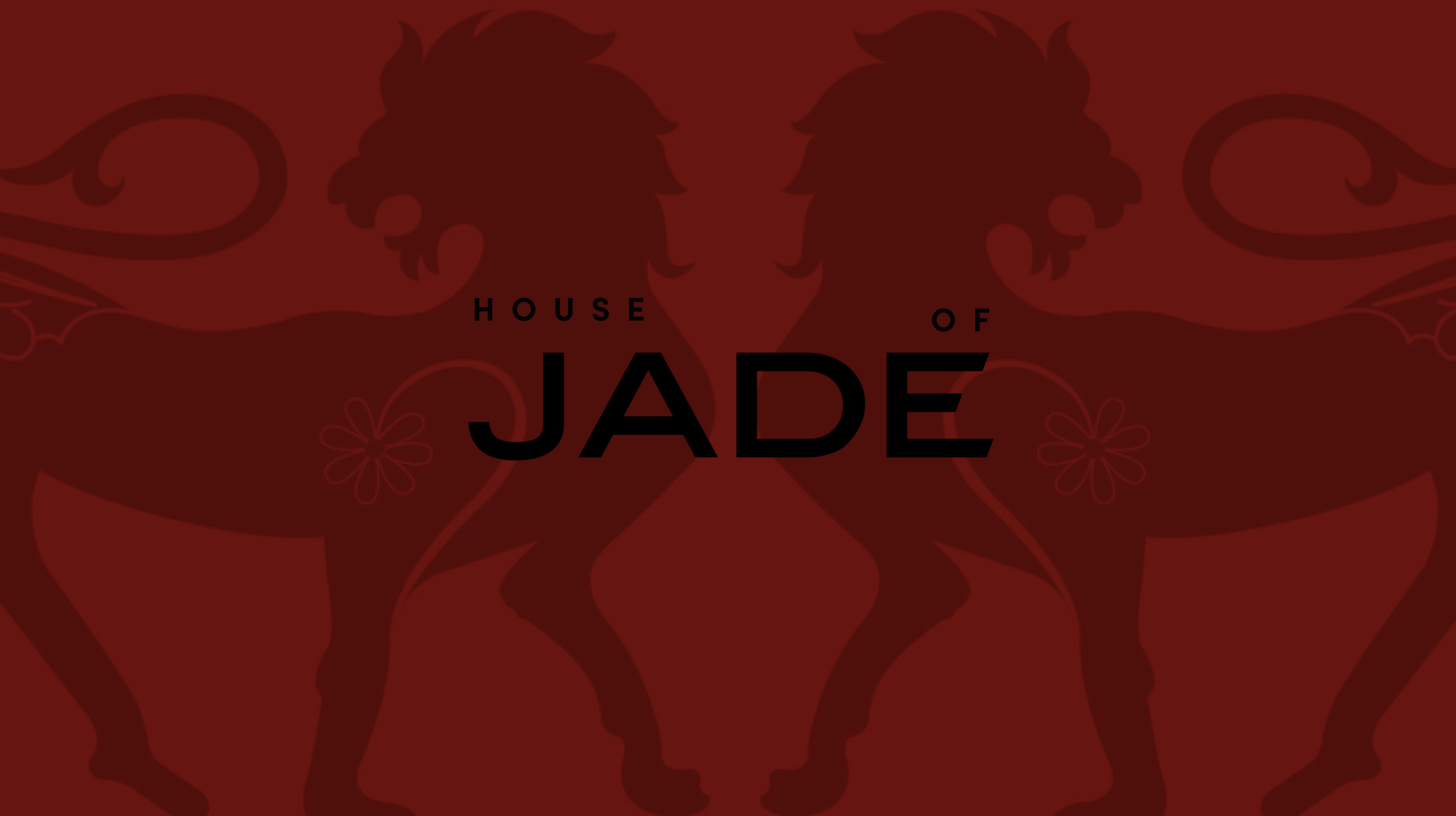
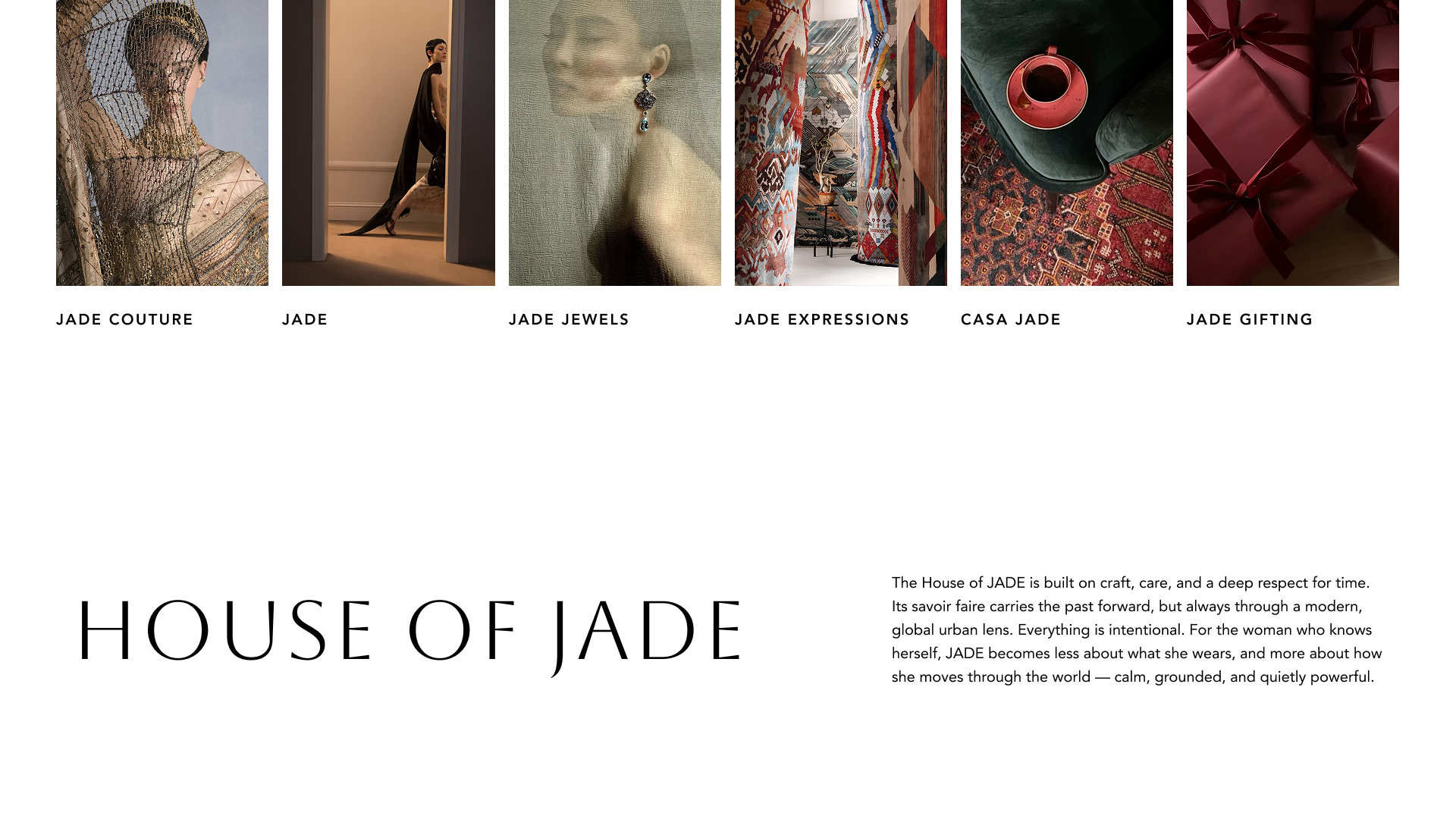
This branding project had the goal to extend JADE’s current brand identity from just bridal couture to a multi-dimensional couture that holds verticals like home, cafe, art etc as well. Introducing, House of JADE.
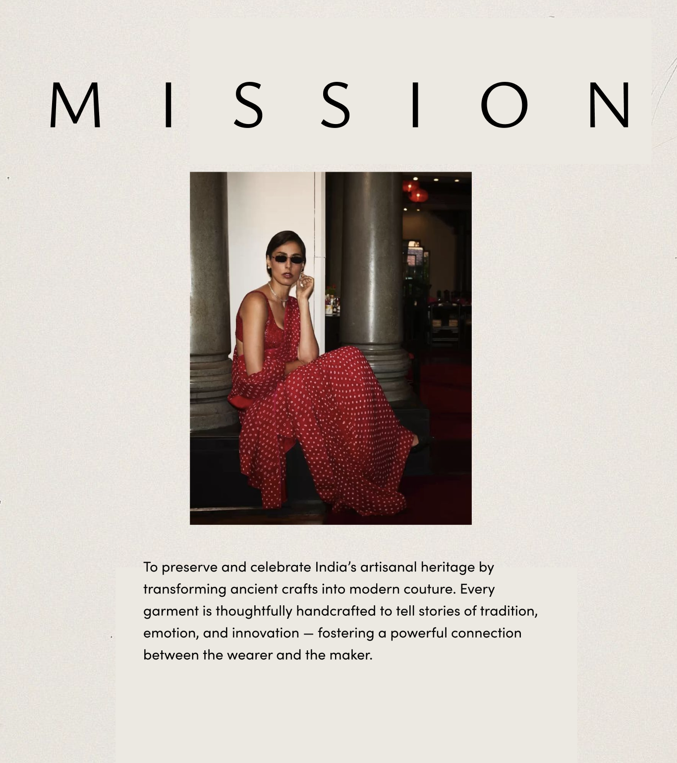
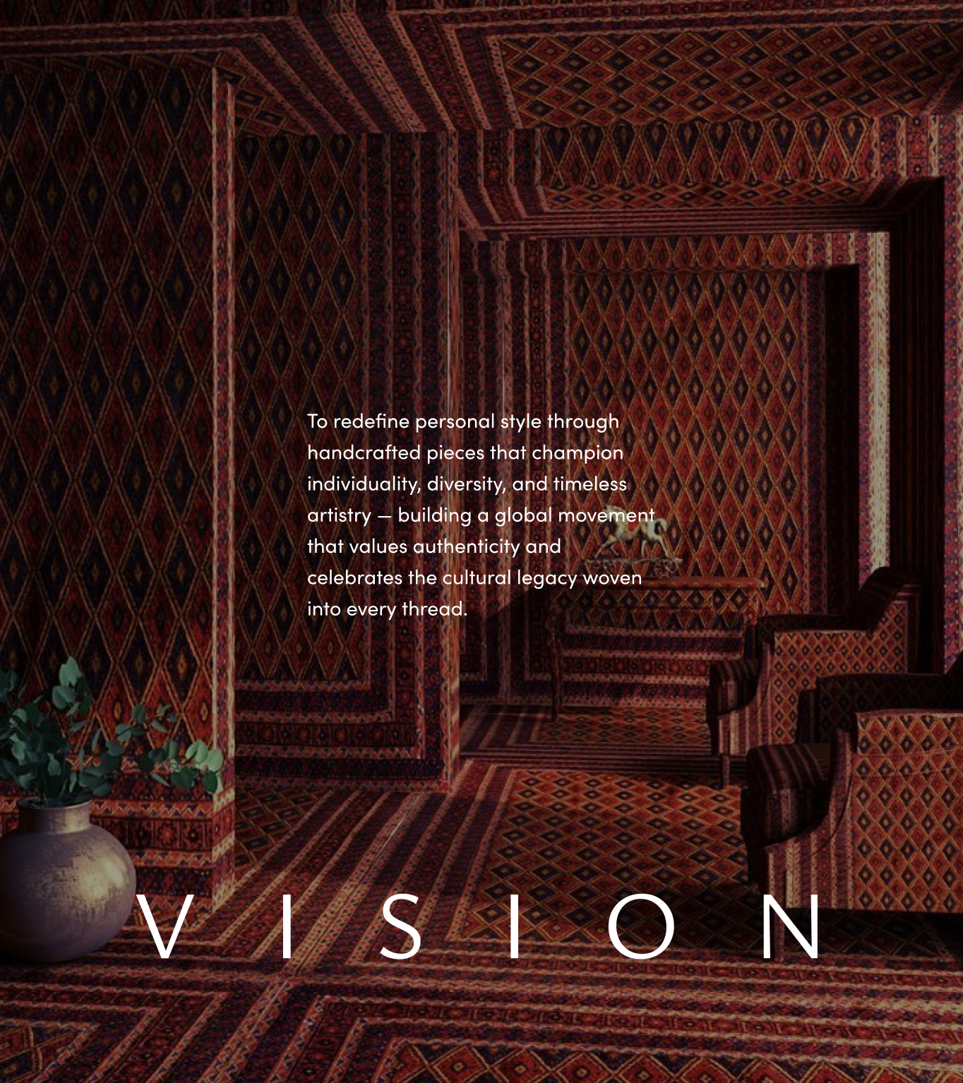
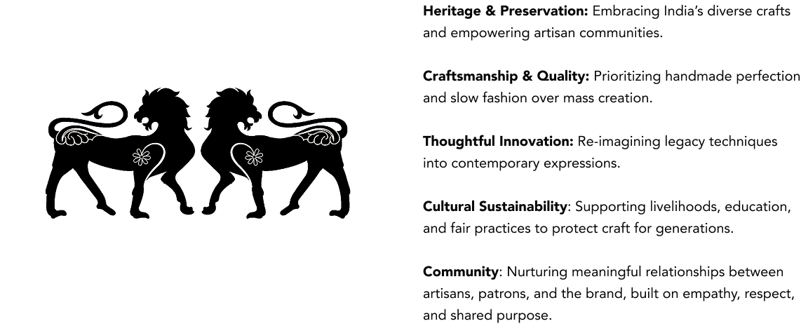
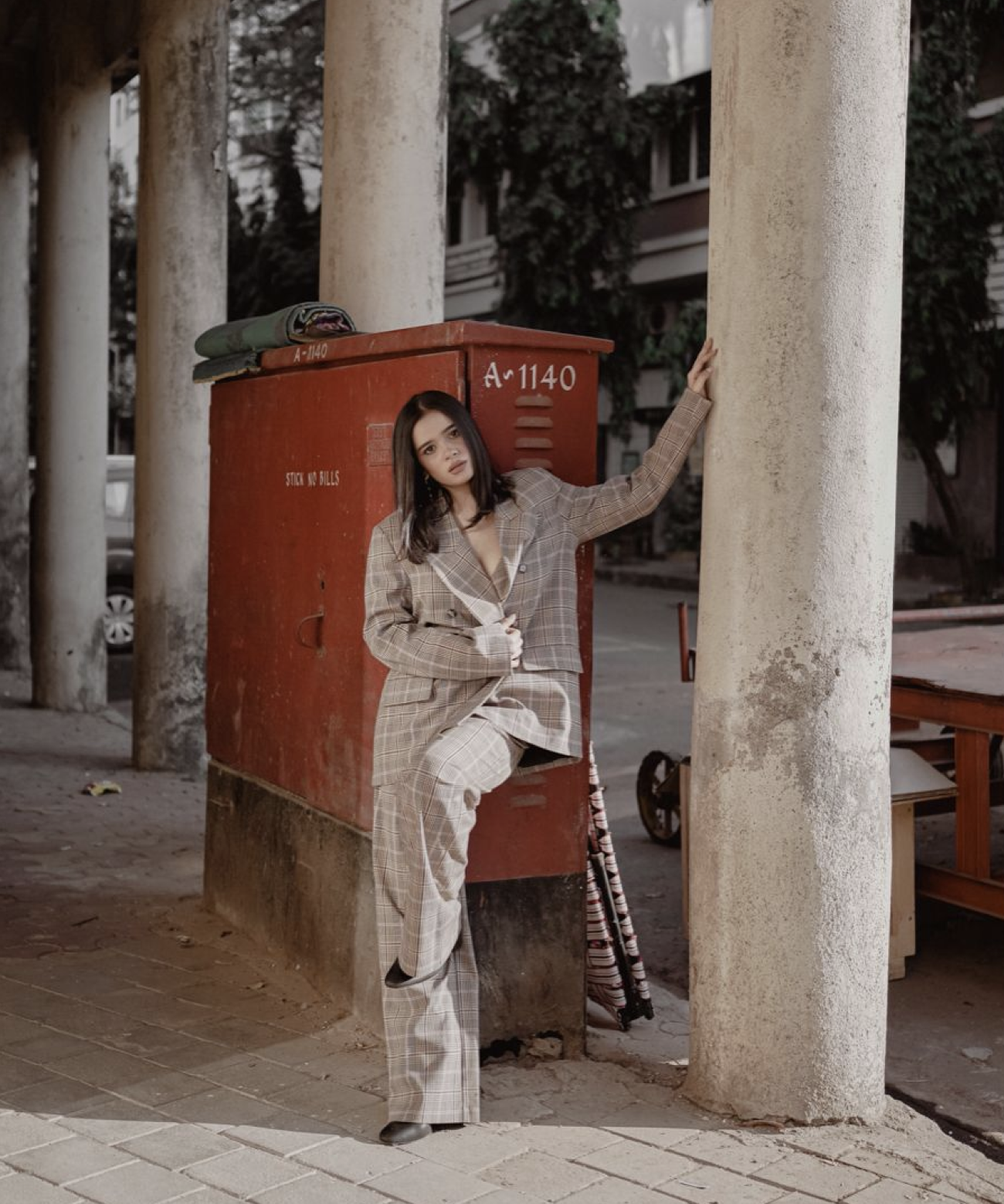

JADE speaks to modern, affluent women - primarily 25 to 45 - based in India’s urban cultural hubs such as Mumbai, Delhi, and Bengaluru. They value craftsmanship, exclusivity, and meaning in luxury.
They desire garments that are emotionally resonant, crafted with intent, and deeply personal.
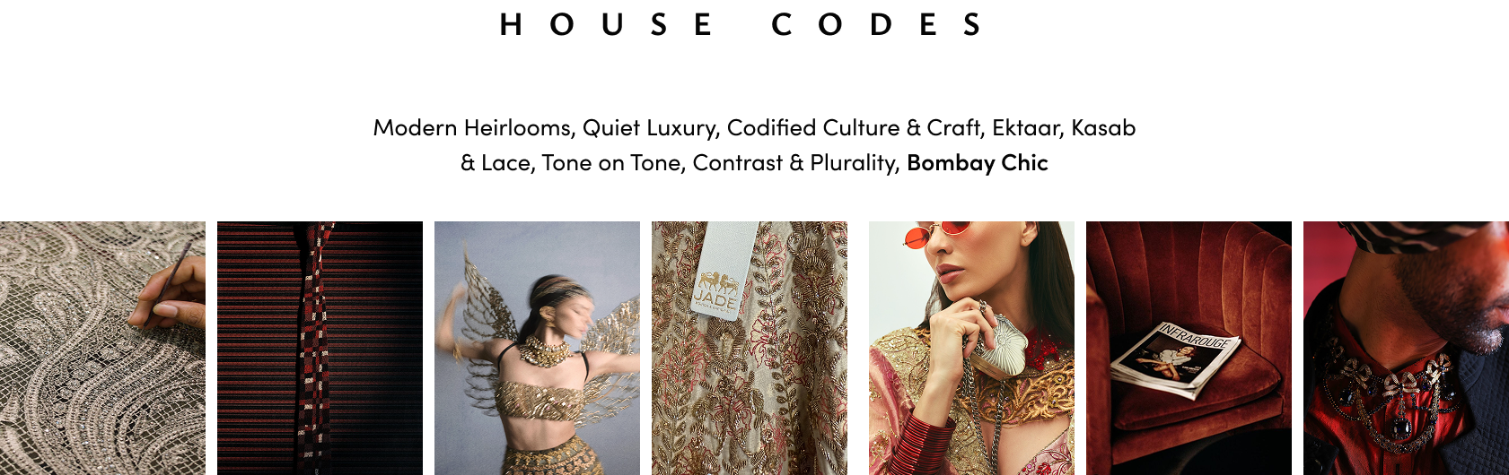

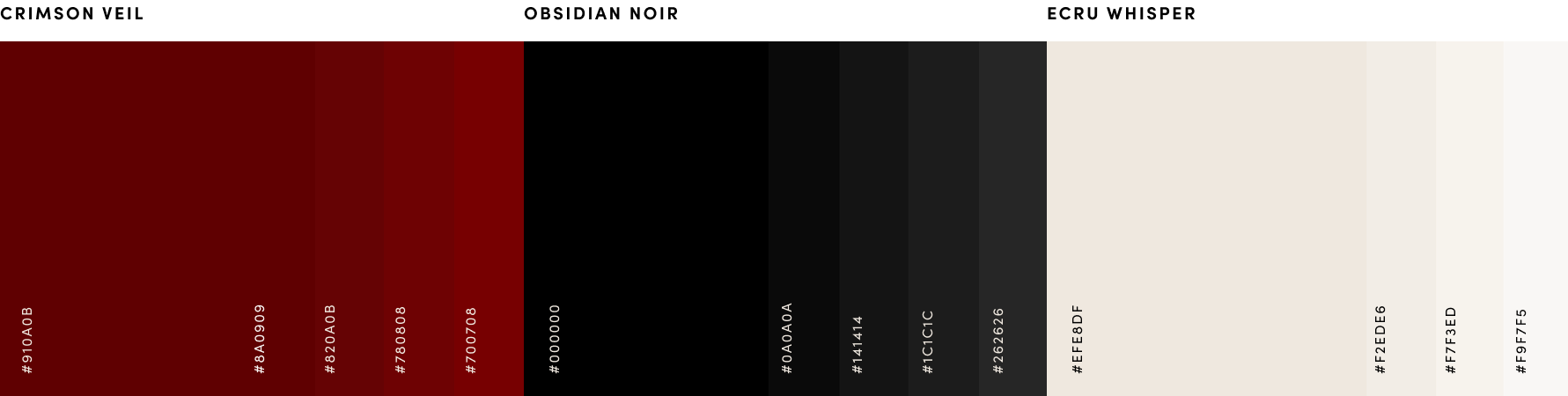
House of Jade’s palette centers on Crimson Veil, a deep, ceremonial red that honours Indian heritage, anchored by Obsidian Noir for structure and evening sophistication. Ecru Whisper softens the composition, offering light and space for detail to shine. Together, they create a world that is rich, refined, and unmistakably modern couture.


Deep Mauve, Sage Green, Ochre Gold, and Coral Pink act as refined accents to the core palette, adding depth, warmth, and seasonal storytelling.
These hues echo gemstones, antique textiles, and evening light that enrich the world of House of Jade without overpowering its signature tones.


Crimson Veil, Obsidian Noir, and Ecru Whisper should lead every composition, creating a rich yet restrained canvas. While Deep Mauve, Sage Green, Ochre Gold, and Coral Pink are used as considered accents.
Together, these combinations echo layered textiles: grounded, luxurious, and quietly expressive.

READY-TO-WEAR LOGO
CLASSIC LOGO
HOUSE LOGO

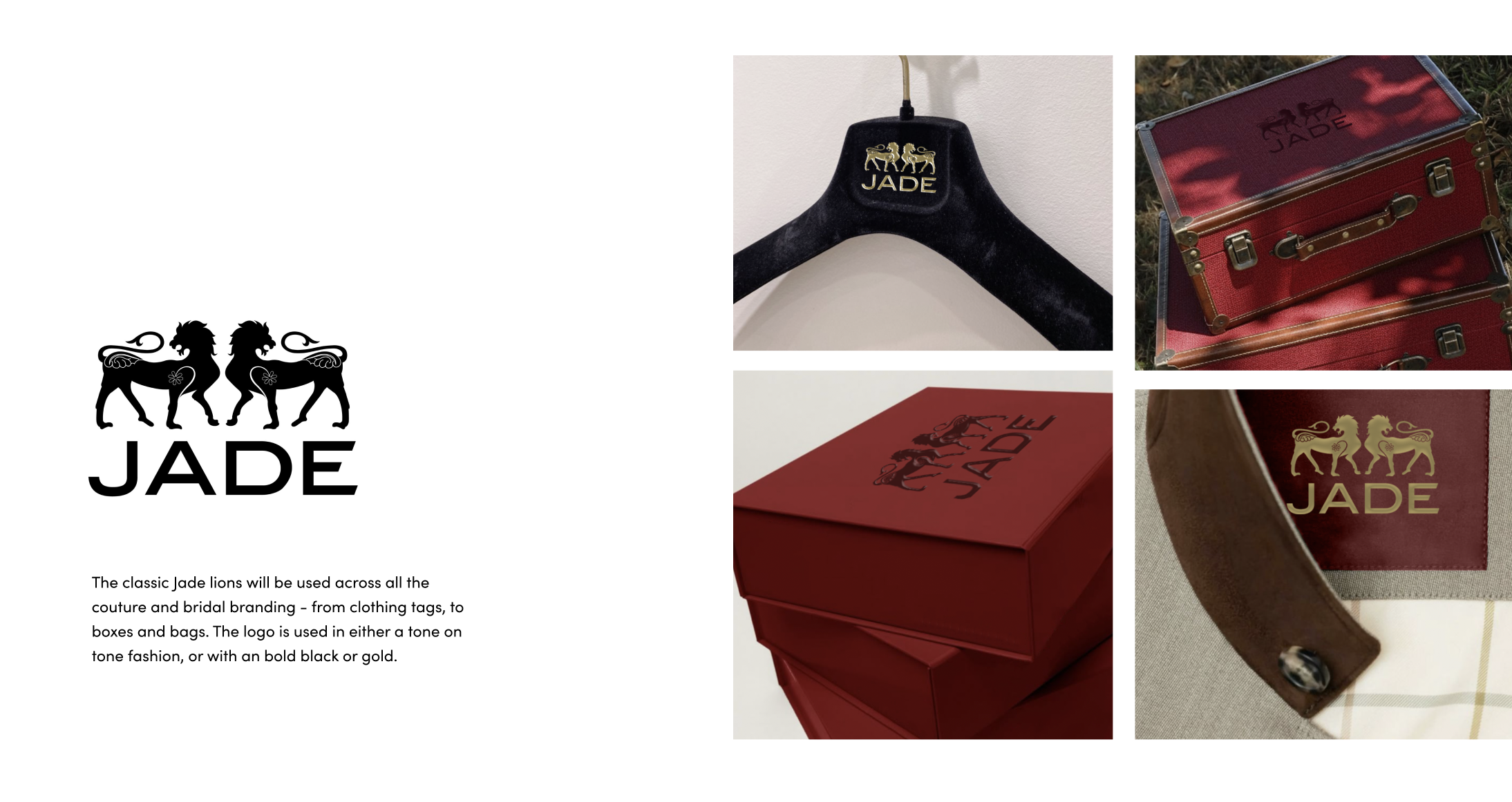
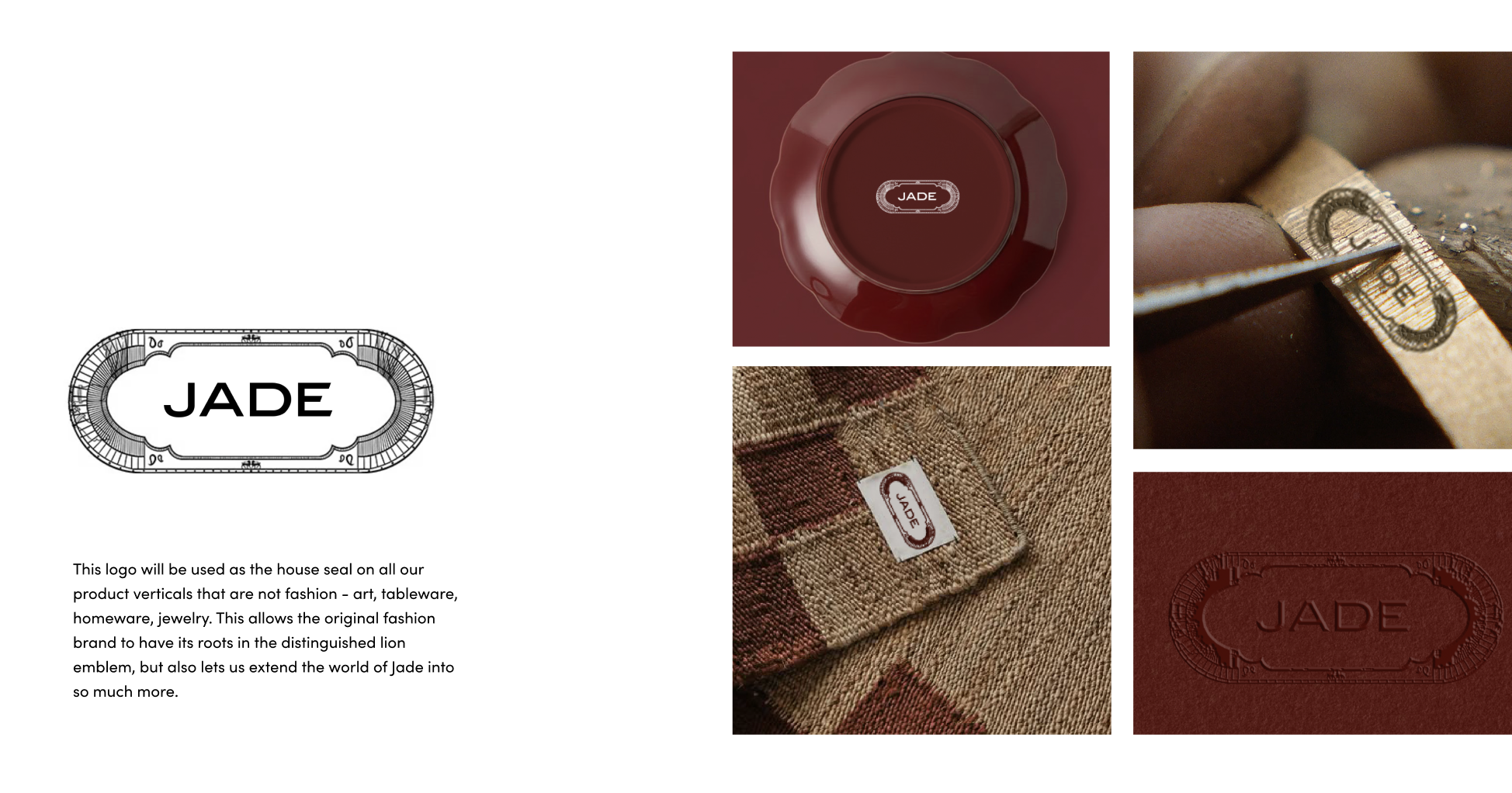
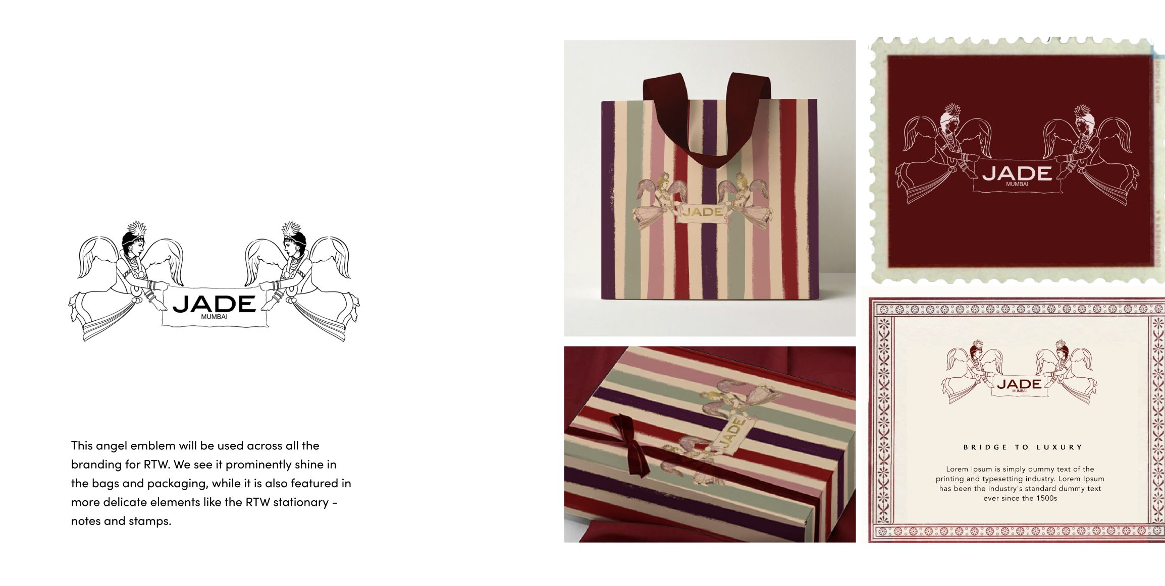


Our typography mirrors the house’s philosophy of heritage and modernity in dialogue. Aboreto, used for primary headings, evokes the delicacy of hand embroidery and the sculpted lines of couture silhouettes. Avenir, in Heavy and Roman for sub-headings, body and captions, brings a clean, contemporary rhythm that grounds the brand in clarity and confidence. Together, they create a refined typographic system that feels timeless, luxurious, and unmistakably modern Indian.

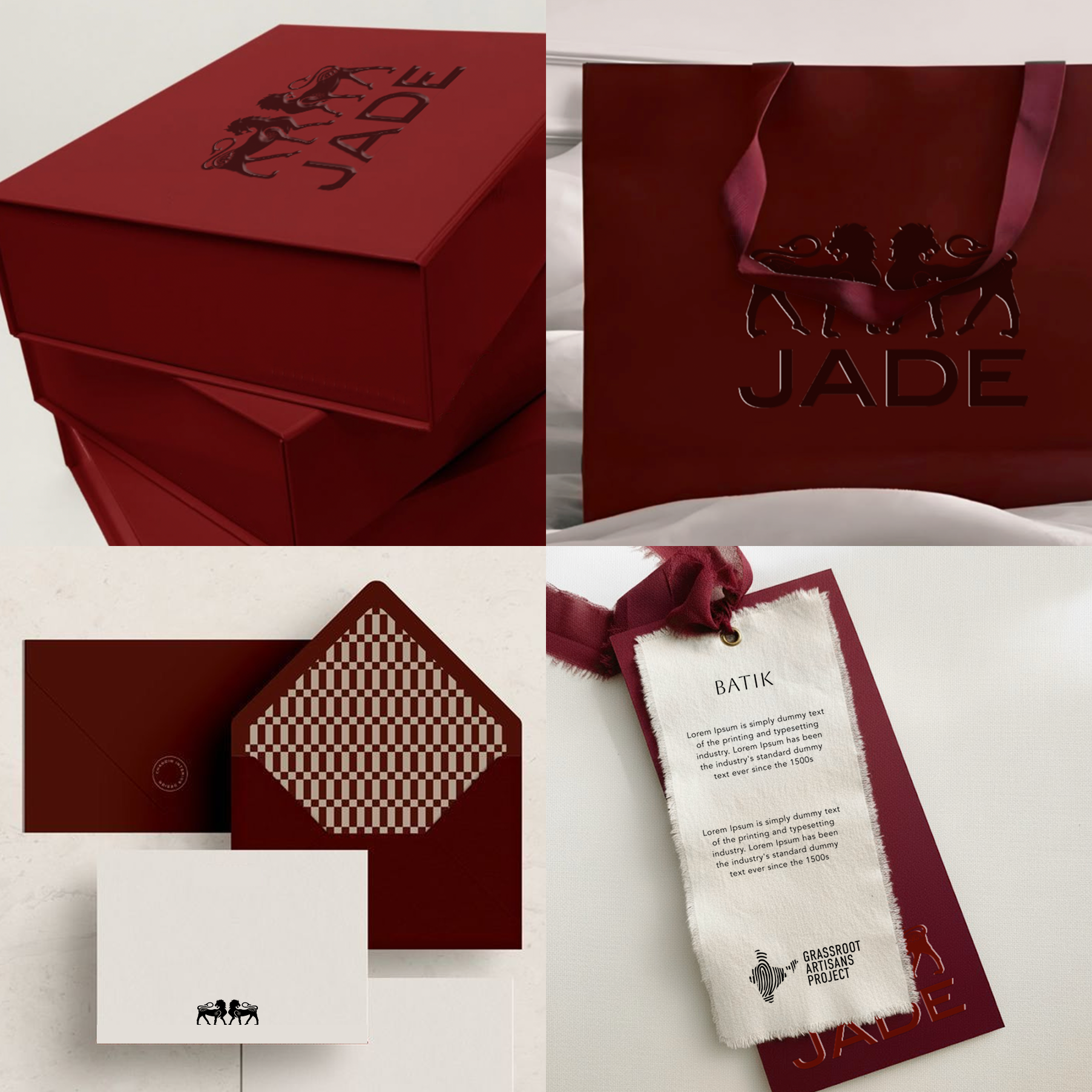

This packaging and stationary that utilizes the core brand color and the classic JADE logo with the lion motifs was designed to be used across all the JADE Couture product lines.
Timeless. Bold. Chic.
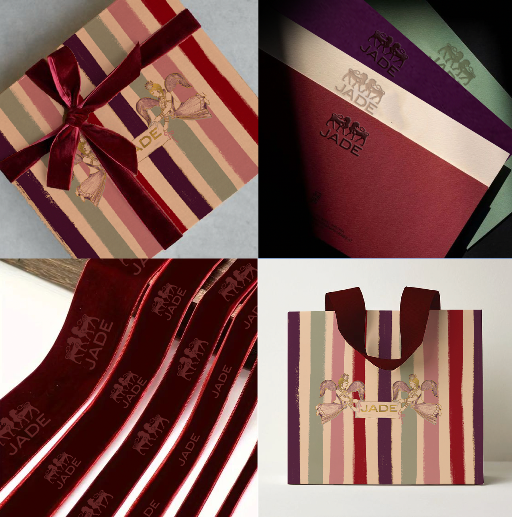

The Ready-to-Wear packaging and stationary design utilizes the RTW logo along with a balance of the primary and supplementary colors. The primary RTW with the angels are used in larger collateral, while the classic logo supports in finer details.
Whimsical. Playful. Artistic.


Packaging for Casa JADE would also span across the gifting and art verticals. This design takes the bold brand color just like the couture packaging, and the stripes from the RTW packaging, paired with the house logo.
Royal. Elegant. Elevated.

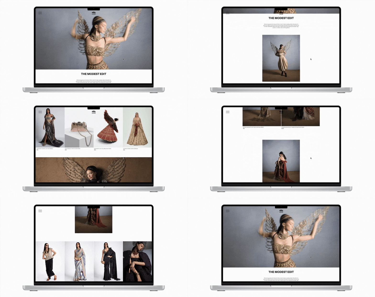
The new website design carried forward the same design language of the new brand ethos, moving away from simply e-commerce to storytelling and craft rooted in heritage and balanced with modern flair.