
Building a stronger foundation for the ClassPass app
PROJECT TYPE
Design system, UI kit, product design, documentation
1 Semester
client
ClassPass
DURATION
team
4 product designers
my role
Product designer / design systems contributor
deliverables
Interface inventory, Figma UI kit, accessibility-audited component library, ZeroHeight documentation site, final pitch deck
ClassPass has a strong product, but its interface needs a stronger system.
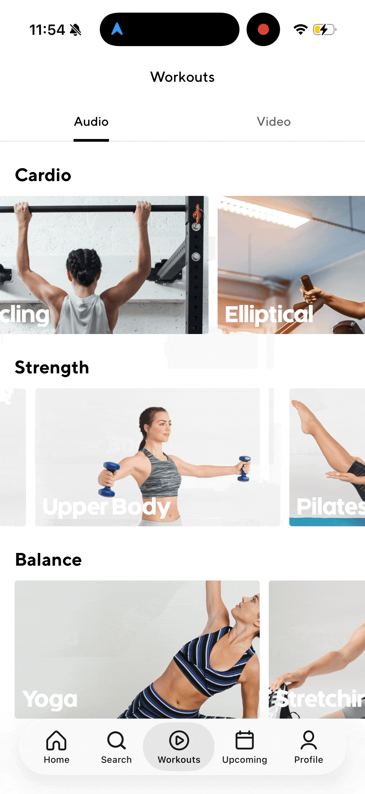
ClassPass helps users discover, compare, and book fitness and wellness experiences. But as we examined the app more closely, we noticed that the interface did not always feel as strong or seamless as the service itself.
These inconsistencies created a larger design challenge:
how cAN ClassPass continue scaling its product experience without creating more design debt?
Our answer
a design system built to make the ClassPass app more consistent, scalable, accessible, and easier for teams to use.
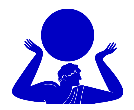
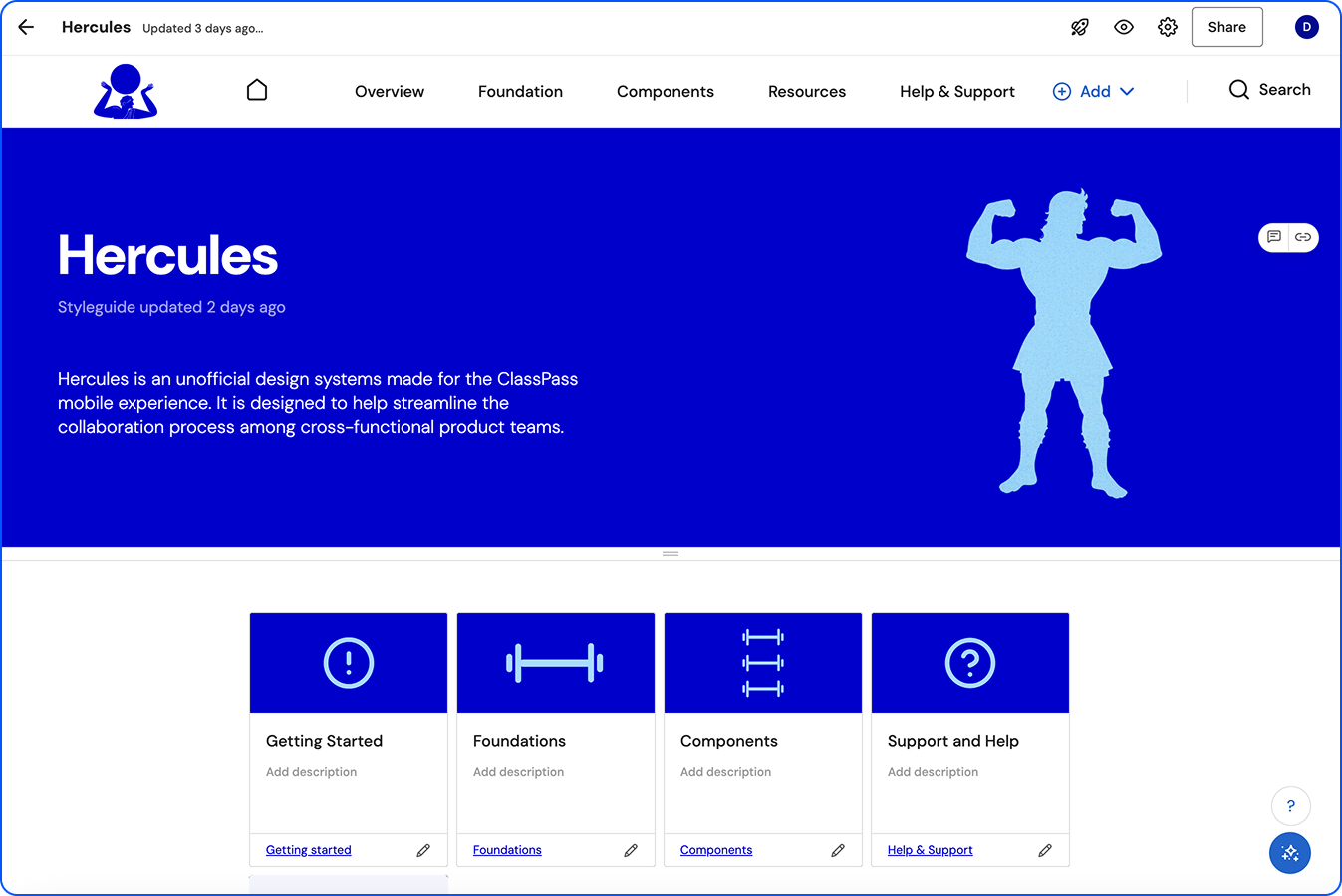
HERCULES

WHY “HERCULES”?
We named the design system Hercules because ClassPass is rooted in fitness, strength, movement, and personal growth. Hercules represents strength and reliability, which aligned with what we wanted the system to provide for ClassPass.
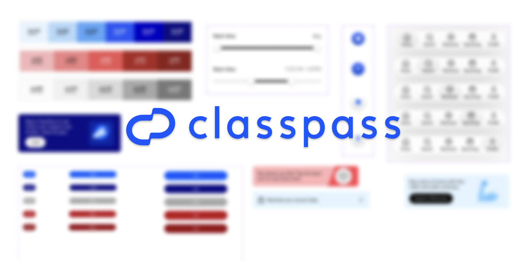
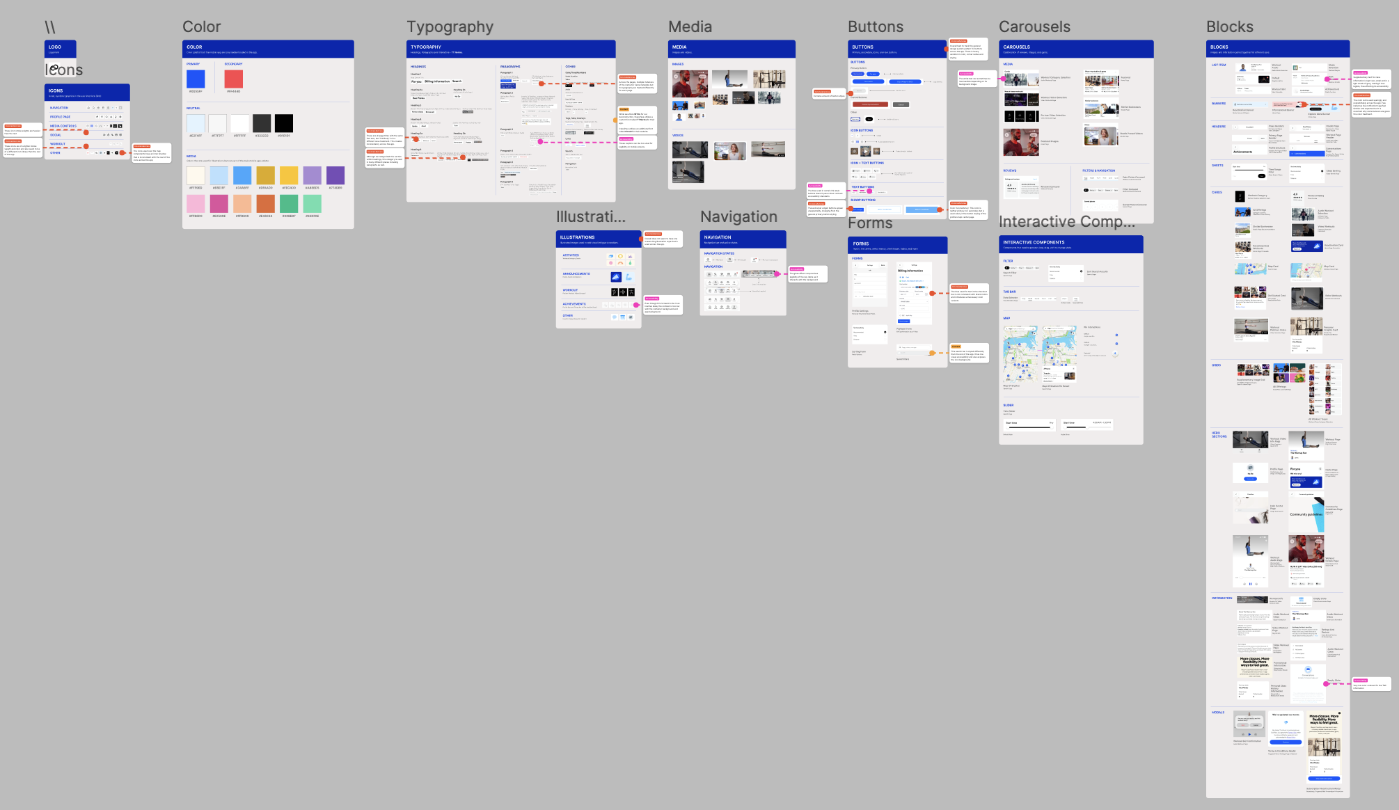
The final Hercules system included two major artifacts:
A complete Figma UI kit
A ZeroHeight documentation site
Together, these created both the design assets and the instructions needed to use them correctly.
HOW DOES HERCULES MAKE A DIFFERENCE?- Lauren Loprete.
It helps the designers and developers of ClassPass to have a shared language that establishes guidelines for both consistency and collaboration.
To create this system our team established the following key principles:
“A CULTURE CHANGE DISGUISED AS A UI KIT”
Clarity over cleverness. Every element should communicate its purpose immediately. Progressive disclosure keeps each screen focused on one goal at a time. If it needs explaining, it needs simplifying.
UNDERSTANDABLE & USABLEFrictionless by default. ClassPass's product promise is that fitness should be easy to start, easy to try, and easy to leave. The design system should enforce this: booking a class should feel lighter than it is
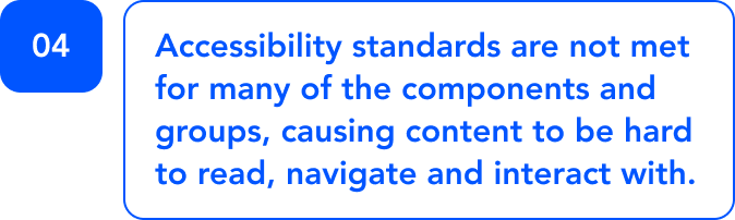
Low commitmentEvery color token must meet WCAG AA contrast. Every interactive element must be reachable by keyboard and screen reader. Designing for the edges of your user base makes the centre easier for everyone.
Accessible & inclusiveClassPass is about motivation and getting people excited to move. The design system should carry some of that energy. This isn't about gratuitous animation or decorative noise, It's about moments that reward the user.
Enjoyable, delightful & human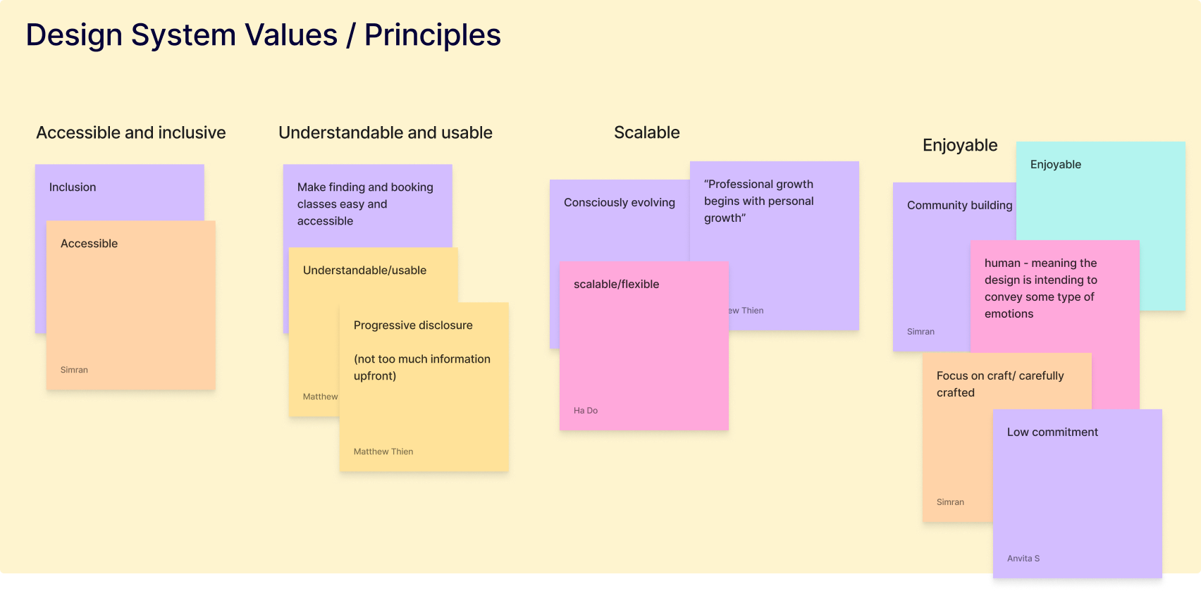
The system should be easy to extend and hard to break. New contributors should be able to add components without introducing inconsistency. Tokens, not hardcoded values. Semantic naming, not literal.
Consciously scalableMY CONTRIBUTION:
01. Deconstruction
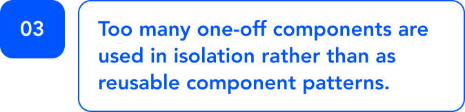
During the exploratory phase of our project, I took the lead in identifying and organizing all larger component groups such as cards, banners and carousels into “blocks”.
02. recreation
I held the responsibility for designing the buttons, pills, tabs, banners, list items, headers and some cards. Here I was also refining these elements to create visual consistency that the app is currently missing.
03. documentation
I formatted and built the documentation pages for our design system in Zeroheight. My primary focus was on the components pages; generating their design, anatomy and guidelines.
Each phase helped us move from observation to structure, and from structure to a system that could be adopted by real teams.

Breaking down the app TO STUDY THE interface inventory
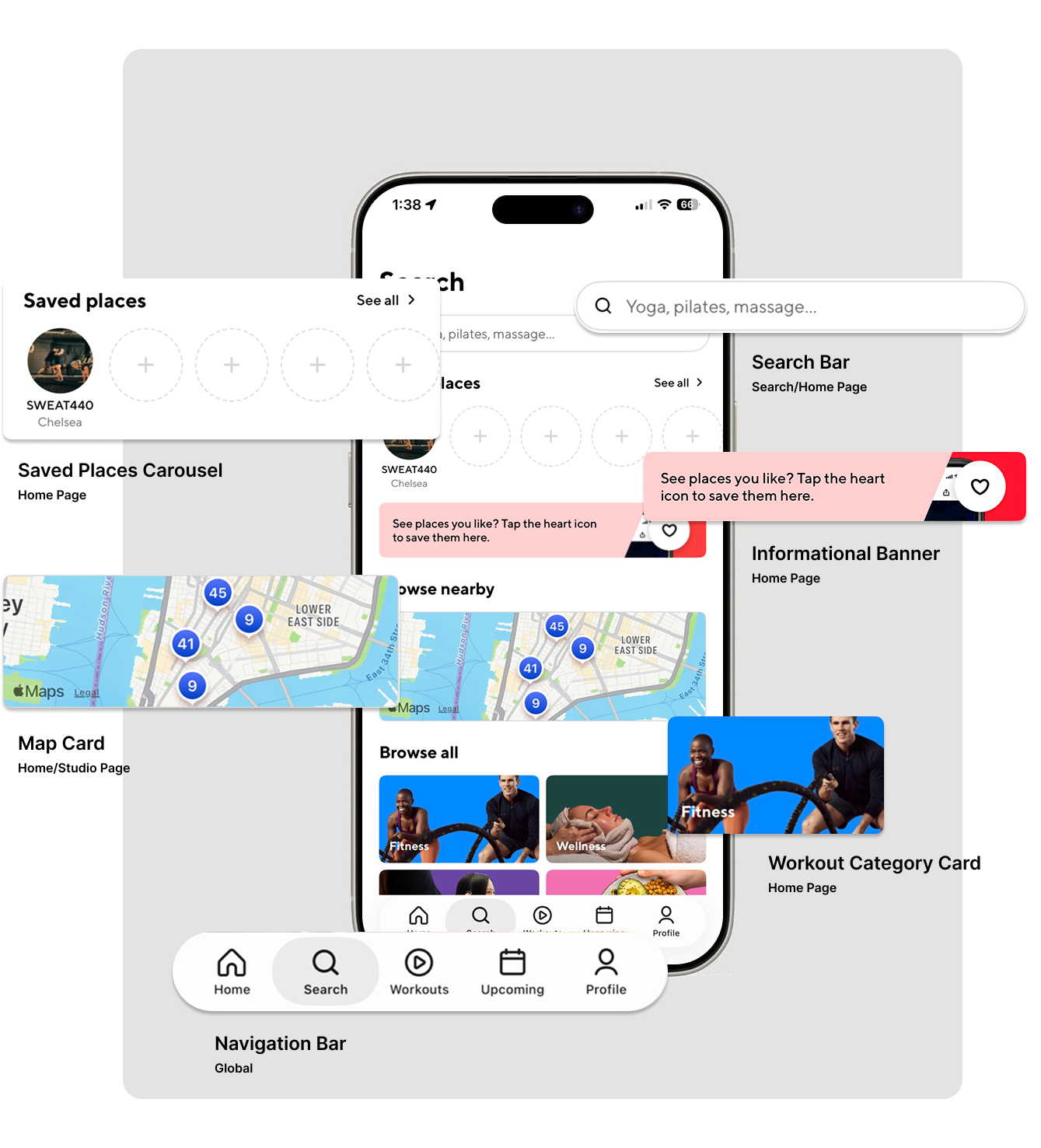
Before designing new components, we needed to understand what already existed. We collaboratively built an interface inventory in Figma, following Brad Frost’s approach of collecting the visible parts of an interface and sorting them into meaningful categories.
We captured and organized UI elements across the ClassPass app, including but not limited to: colors, typography, icons, buttons, inputs, cards, navigation elements, filters, Studio and class detail elements and media.
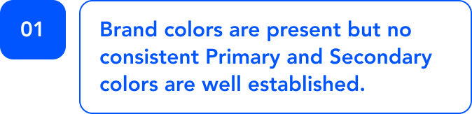
The inventory revealed that ClassPass had many strong individual interface elements, but they were not always working as one system.
We found:
Similar buttons with different sizes, colors, and states
Multiple typography treatments for similar content types
Iconography that did not always feel visually unified
Repeated card patterns that could be consolidated
Inconsistent hierarchy across discovery, booking, and account flows
The interface inventory gave us the evidence and we were able to point to specific patterns and show where the product experience was breaking down.
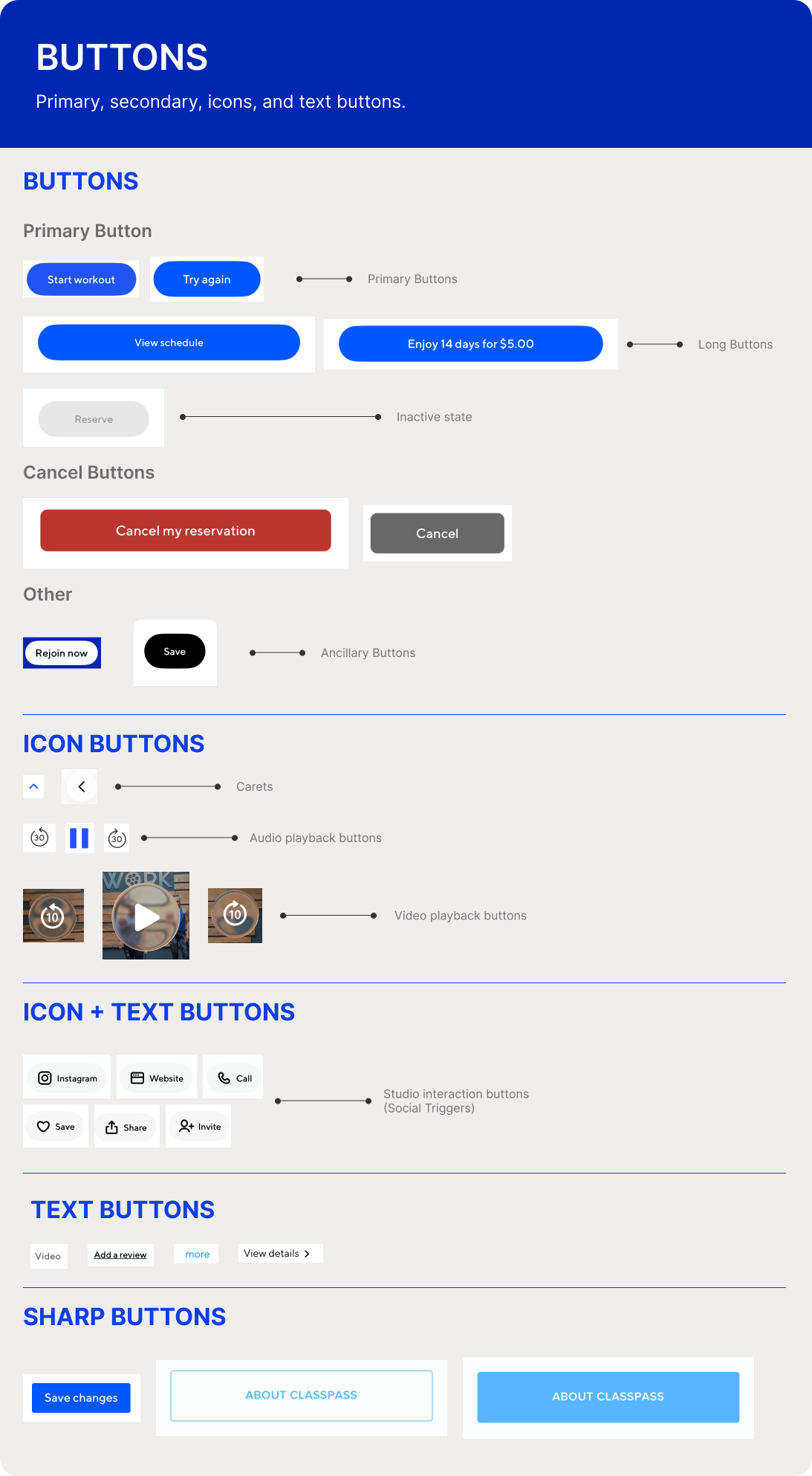
CORE PROBLEM:
INCONSISTENCY
Too many different icons styles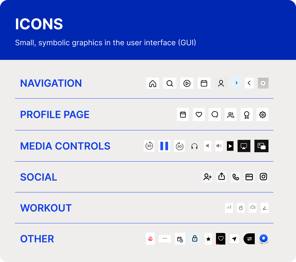
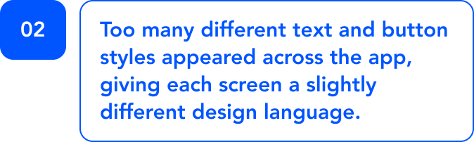
Too many DIFFERENT button stylesToo many DIFFERENT text styles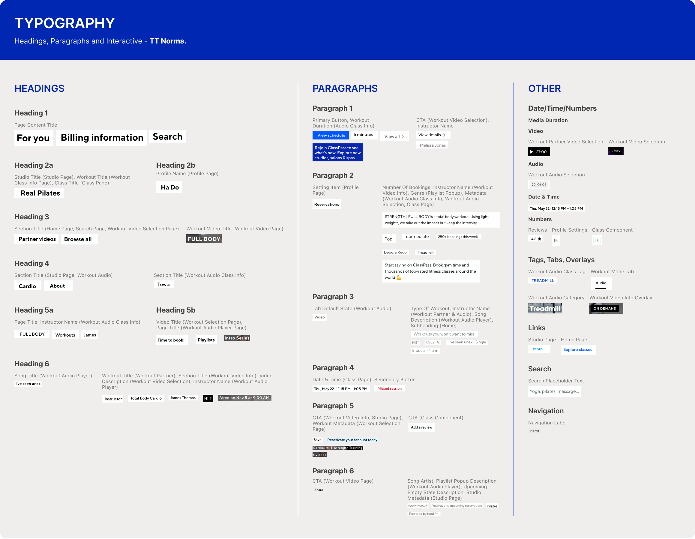
SECONDARY PROBLEM:
ACCESSIBILITY
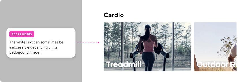
MEDIA TITLES ARE NOT ALWAYS LEGIBLEBUTTONS/NAVIGATION WITH GLASS EFFECT HAVE COMPROMISED LEGIBILITY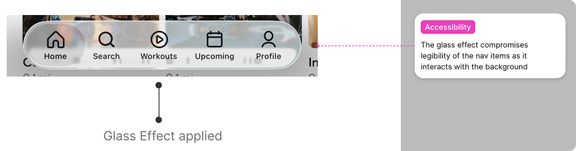


We turned the scattered interface elements into reusable system foundations.
After the audit, we began building the UI kit in Figma. Our goal was to create a comprehensive, usable, and accessible component library that could support ClassPass’s current experience and future growth.
We built the system from the smallest pieces upward, starting with foundational components like color, typography, and spacing.
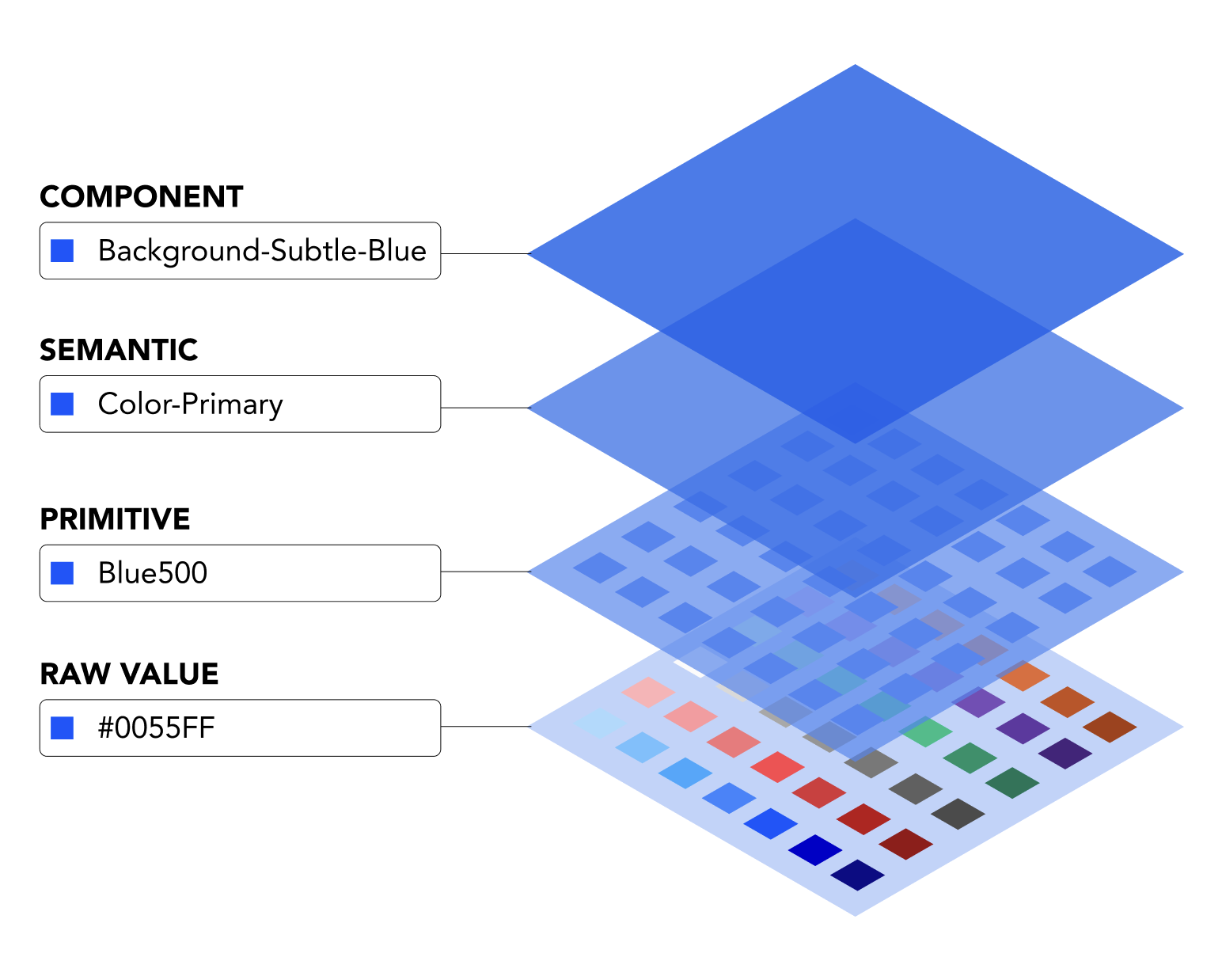
RE-BUILDING FROM THE GROUND UP
We started by establishing design tokens in Figma to create a stronger foundation for the system. These tokens gave our team clear rules to design from and provided developers with a consistent visual language for implementation.
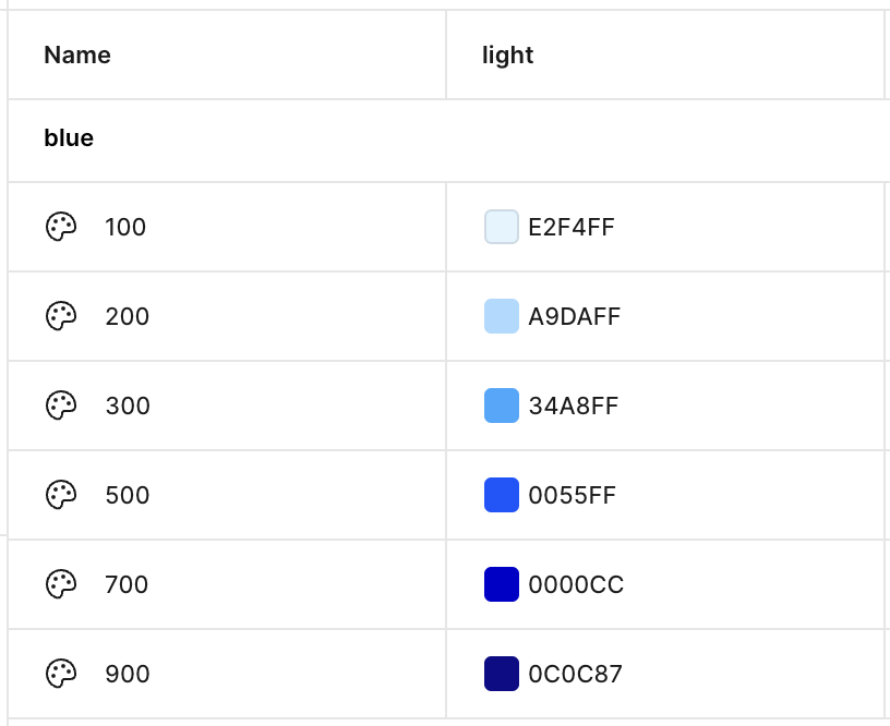
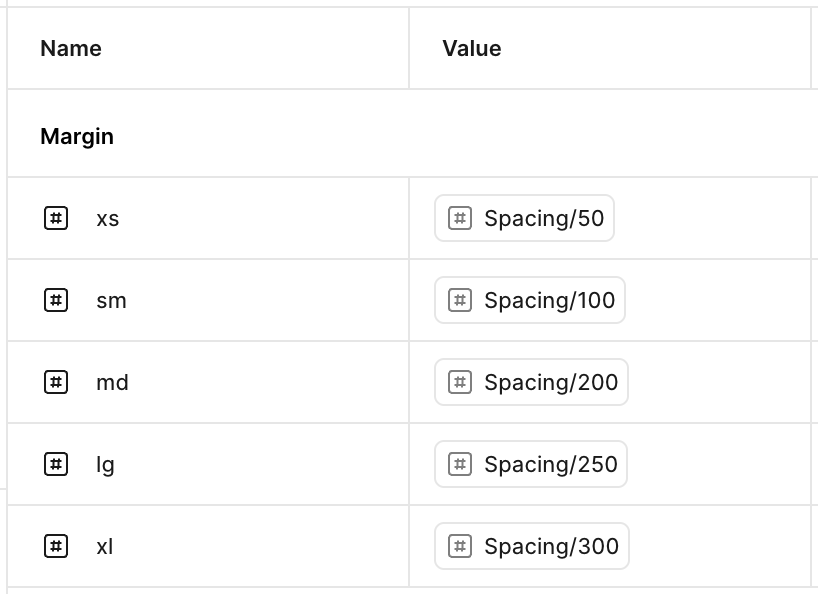
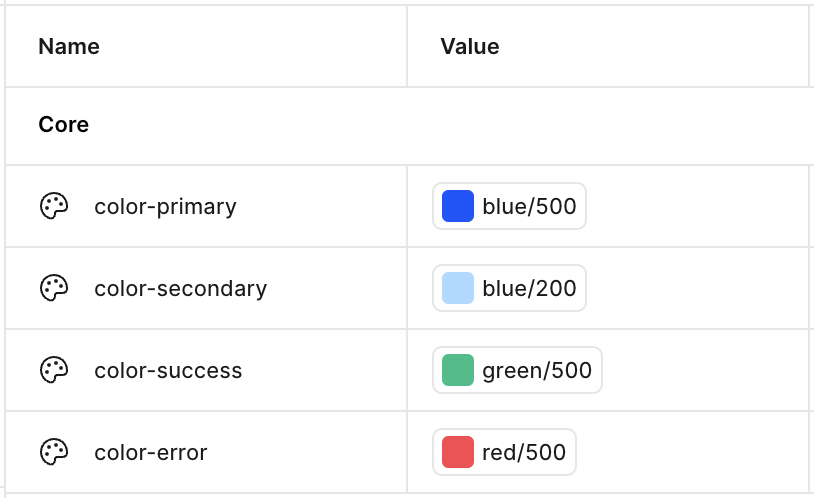
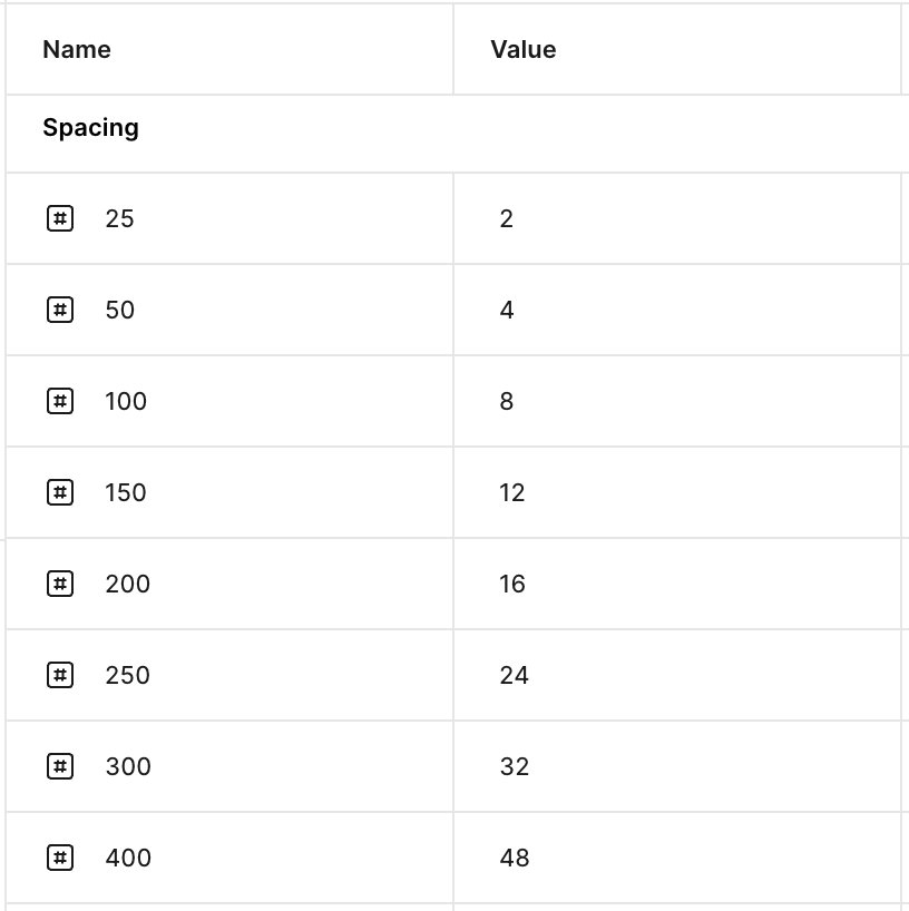
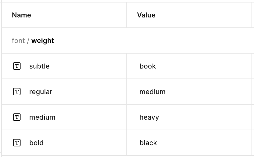
This formal style guide gave us clear guidelines for making consistent design decisions throughout the project. It also functioned as a living system; as we built out the UI kit, we continued to expand and refine these core foundations as needed.
HOW DOES HERCULES MAKE A DIFFERENCE?“A CULTURE CHANGE DISGUISED AS A UI KIT”
SURVEY INSIGHTS

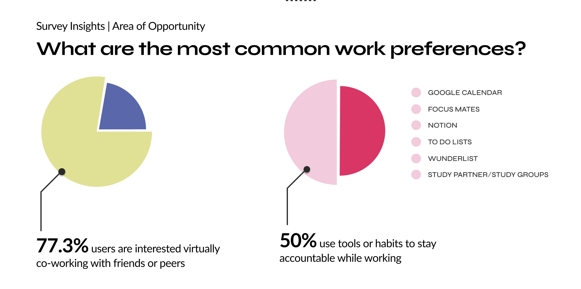
These insights allowed us to understand the market opportunity and curate an interview questionnaire for a subset of users from the survey that would allow us to dig deeper into this problem area and identify the most apt solution with the following goals in mind: