
Procrastination
product design
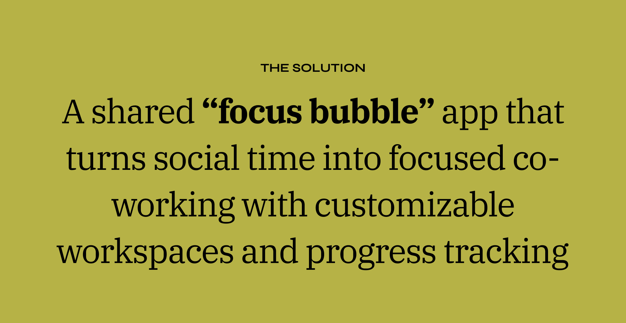
A shared “focus bubble” app where you and friends can co-work virtually. As your progress bar fills during focused work sessions, friends can send micro-encouragements that motivate without breaking concentration. The app flips the model of social media: instead of endless scrolling that drains time and self-worth, it promotes accountability, healthy habits, and positive reinforcement through community.
-
This was a product design project that focused on solving for prevalent societal issues.
-
The team was comprised of 2 UI/UX designers from the Pratt Institute graduate school.
-
UX Researcher, UI Designer, Product Strategist
-
Defining the problem area, opportunity and scope
Ideating solutions
Designing and prototyping
Testing and finalizing the product

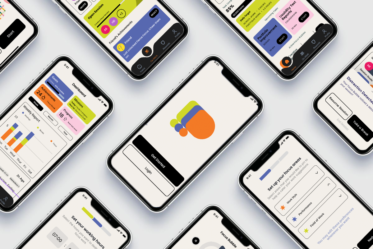
INTRODUCING PROCRASTINATION

Here is a sneak peak of our finished product - a socially driven productivity app that engages its users through friendly incentives and task management systems to stay on track and achieve their target goals!

RESEARCHUNDERSTANDING OUR USERS
USER SURVEYS22 Participants
USER INTERVIEWS7 Participants
Working Professionals, Creatives, Students
TARGET AUDIENCERECRUITMENT METHODSocial media and word of mouth
Google Sheets for surveys and Zoom for user interviews
METHOD OF RECORDINGSURVEY INSIGHTS

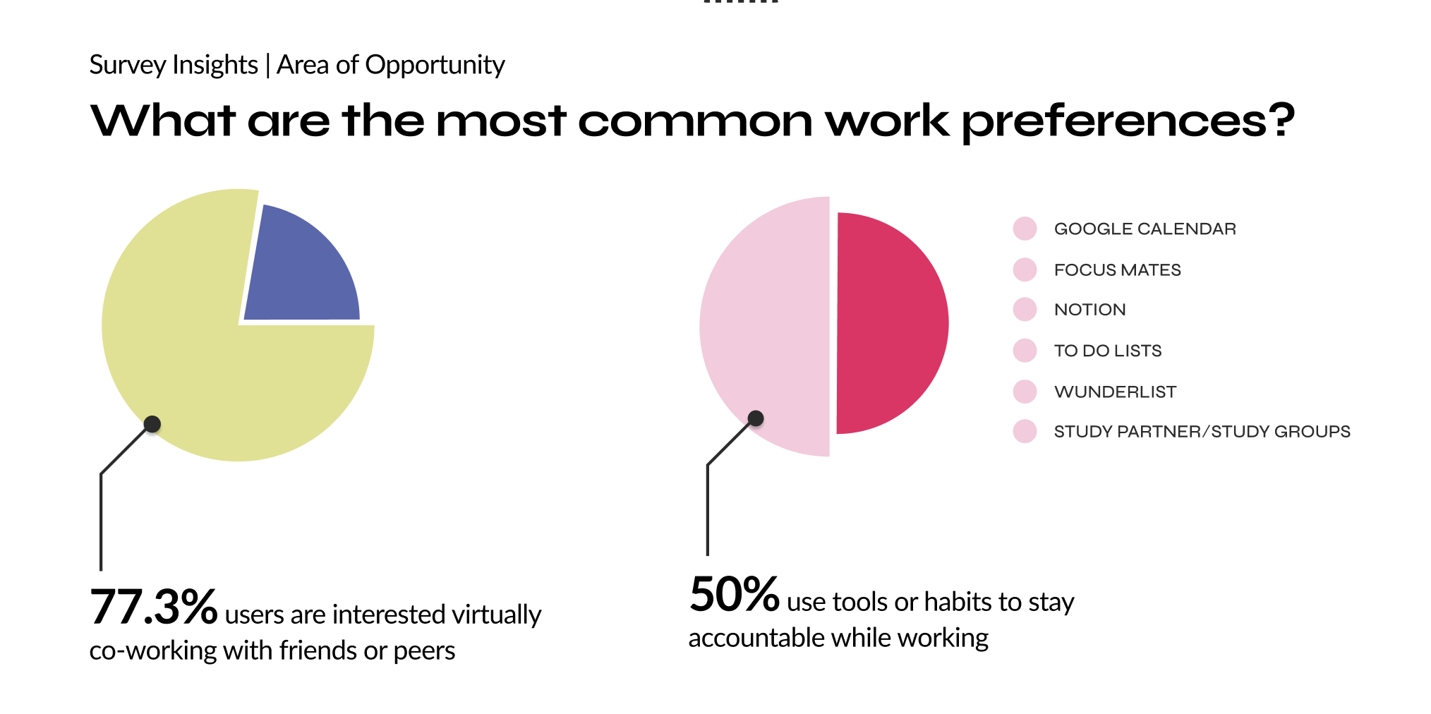
These insights allowed us to understand the market opportunity and curate an interview questionnaire for a subset of users from the survey that would allow us to dig deeper into this problem area and identify the most apt solution with the following goals in mind:
01
UNDERSTAND THE TARGET USER MINDSET TOWARDS DIFFERENT WORKING METHODS
02
UNDERSTANDING THEIR KEY PREFERENCES AND PROBLEMS WHILE WORKING
03
DISCOVER ANY EXISTING METHODS/PRODUCTS THAT ARE BEING ACTIVELY USED TO OPTIMIZE WORK
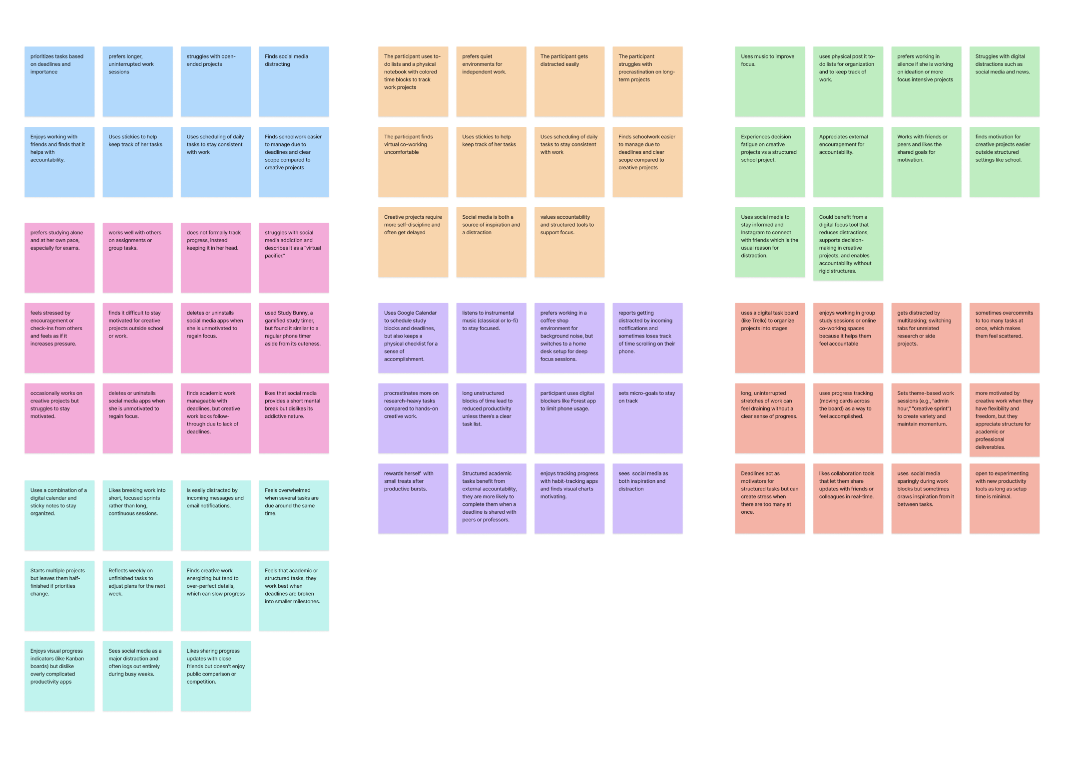

INTERVIEW INSIGHTS

USER PERSONA
Based on the synthesized research insights that we gathered from the user surveys and the user interviews, we created a primary user persona that we would cater our product towards.

USER JOURNEY
Based on our targeted user persona, we mapped out what their average working session journey looks like. This is from setting their intentions on starting a work session to reflecting and planning ahead. This journey includes the actions taken by the user and their pain points, thus our opportunities.

COMPETITIVE ANALYSIS


Spotting the Product Gap

IDEATING THE PRODUCT
IDEATING THE PRODUCT
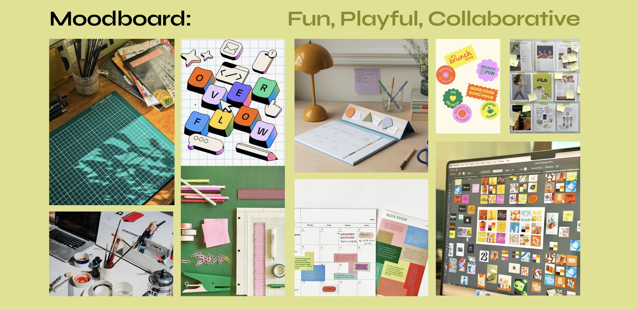
BRANDING
BRAND LOGO

The branding for Procrastination is light, playful yet bold. It attempts to be inviting for users in a way that makes working less serious and more enjoyable.
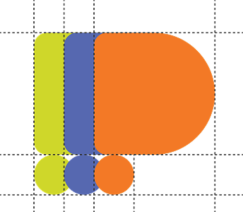
BRAND COLORS
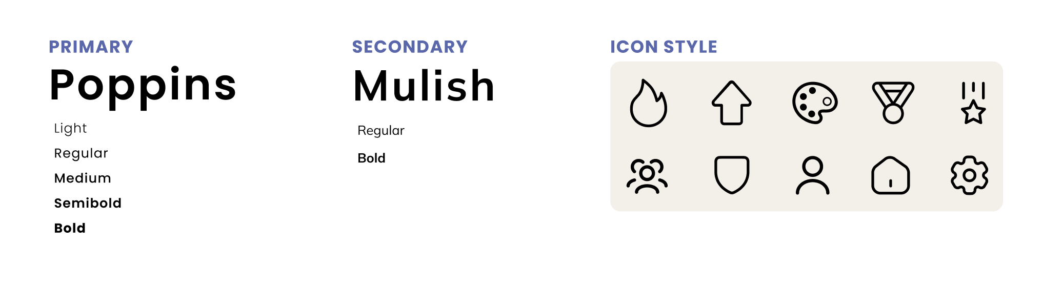
BRAND TYPOGRAPHY
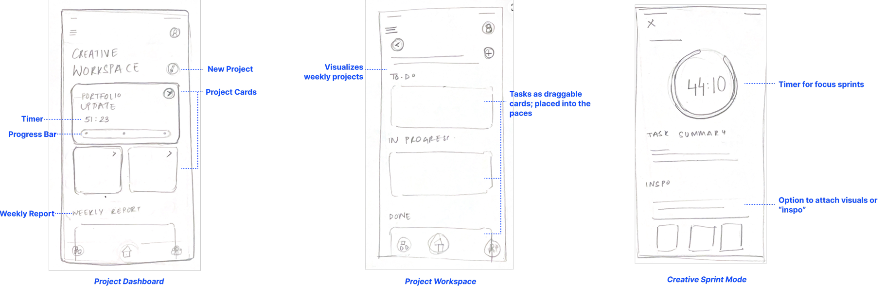
Sketching the Core Experience
We created sketches and lo/mid-fi screen designs to envision what the key features of the app would look like. This included features like the focus bubble timer, work dashboard and personal progress.

We visualized the path a user as they move through the app features and functionalities. This was done through a linear depiction of a specific task performed by the user, ways a user can move through a process to complete a task and screen level instances of how a user would complete a task.
Turning Tasks into Journeys
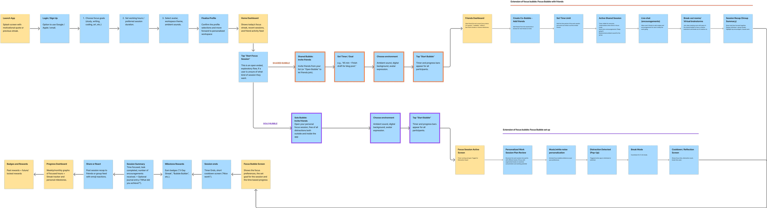
01. user flow (all logic / all paths)

02. task flow (core logic / happy path)
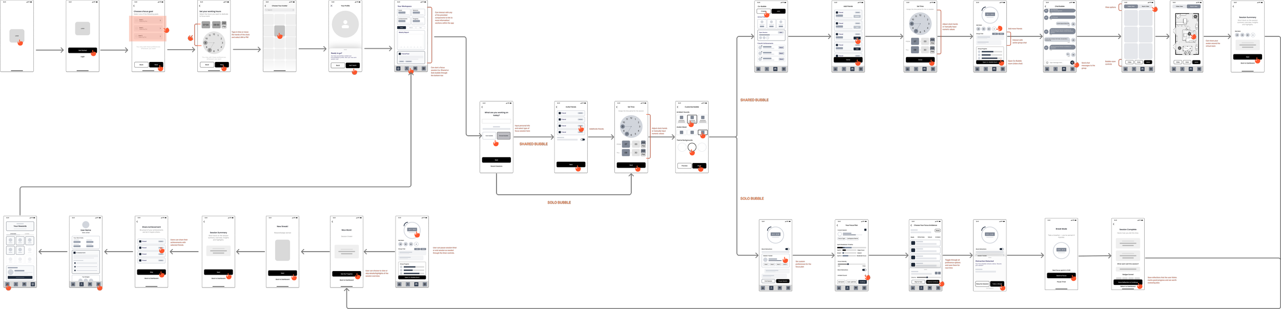
03. Testing our flow: (LOw fidelity designs)
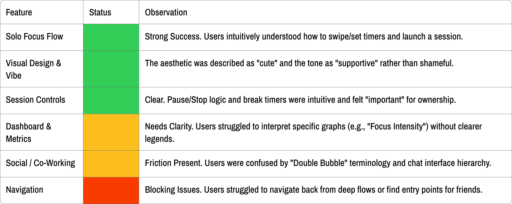
What Users Loved, Missed, and Needed
The tests confirmed that the concept is strong and emotionally differentiated, with clear potential to become a daily companion for focused work. The next iteration should concentrate on clarifying social mechanics, sharpening navigation, and enriching progress feedback, turning ProcrastiNation from a delightful idea into a habit-forming product

OUR FINISHED PRODUCT

