Hooked on phonics
product design
Hooked on Phonics is a learn-to-read program designed to help children ages 3-8 develop foundational literacy skills.
The platform offers a combination of physical learning kits (workbooks, storybooks, and hands-on materials) and digital resources (a mobile app with interactive games and activities).
-
Account Manager: Aayushi Baharadwaj
Project Manager: Gloria Yang
Design Lead: Anvita Shah
Strategy Lead: Conor Mack -
Hooked on Phonics
-
Information Architecture on Learning Resources
Hooked on Phonics recently underwent a major website redesign, but the Learning Resources section was deprioritized and fell out of scope. As a result, this critical area, meant to support parent discovery and ongoing learning, became difficult to navigate and underutilized.
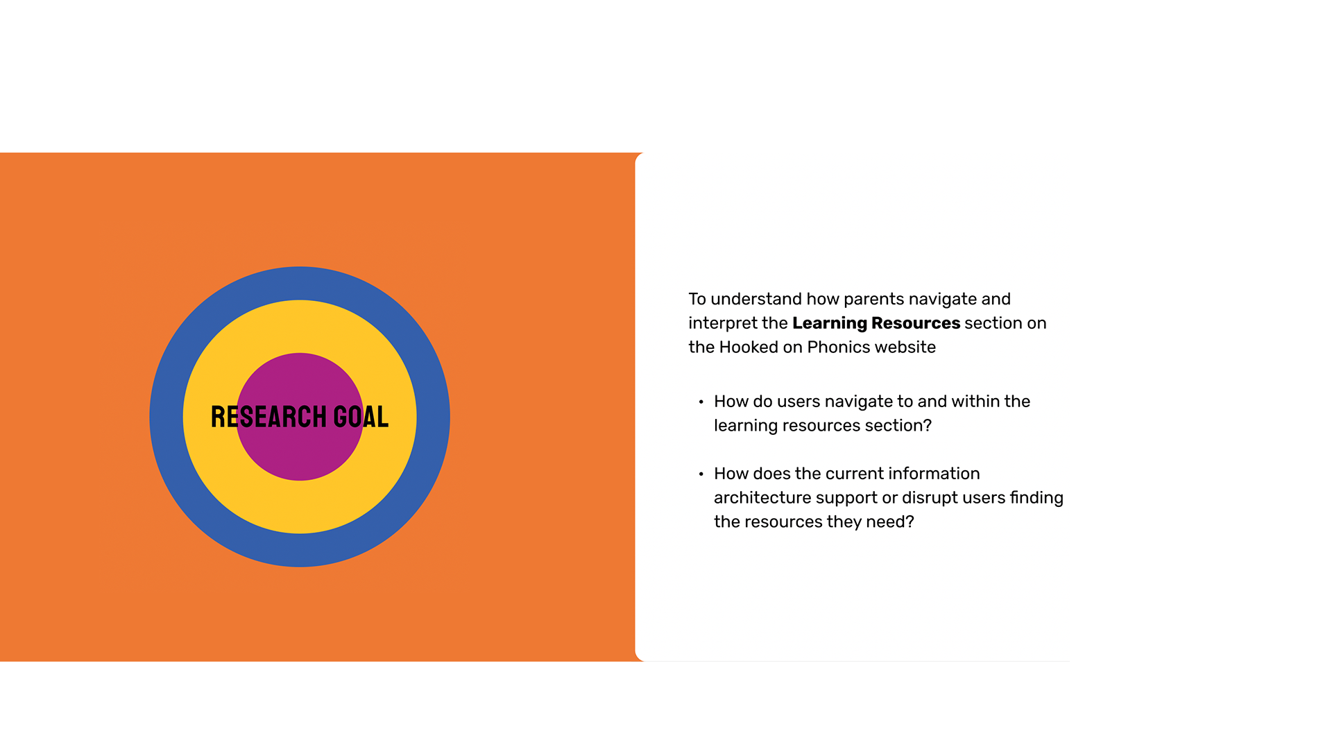
the problem
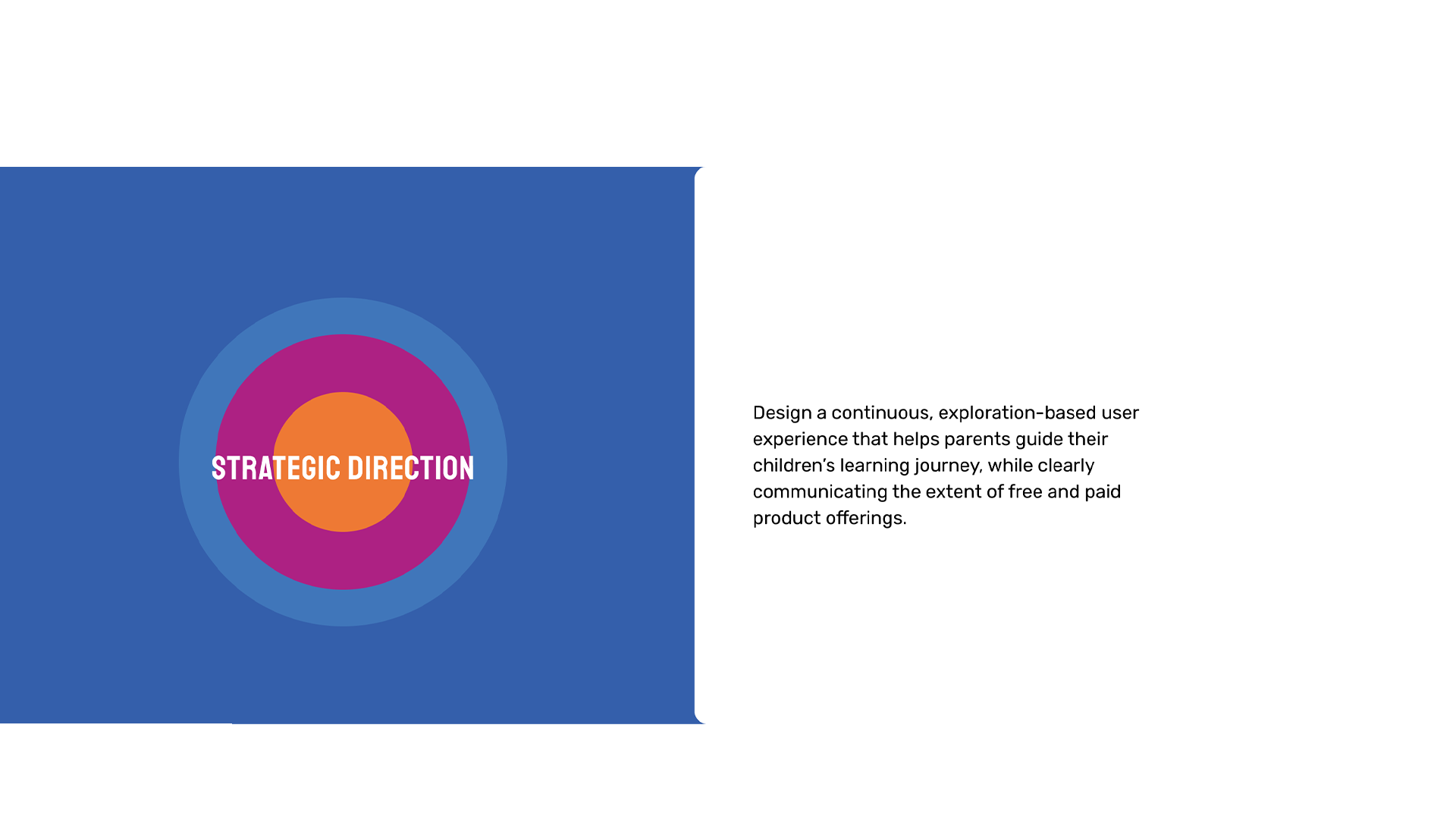
Our team focused on redesigning the information architecture (IA) and user experience of the Learning Resources to address low discoverability, unclear navigation, and weak connections between free resources and paid offerings. Over three months, we focused on creating a continuous, exploration-based experience that helps parents confidently guide their child’s learning journey.
the FOCUS
CORE OFFERING: Their website serves as both a marketing platform and a resource hub, offering:
Free Learning ResourcesWorksheets, videos, and educational games organized by grade level (Preschool through 2nd Grade)
Paid SubscriptionAccess to the full Hooked on Phonics app and physical learning kits delivered monthly
Educational ContentArticles and guides for parents on reading fundamentals and learning strategies
After three months of in-depth research, design, and iteration, we are proud to present the redesigned Hooked on Phonics Learning Resources experience
HOW DID WE GET HERE?
uncovering pain points and building design direction
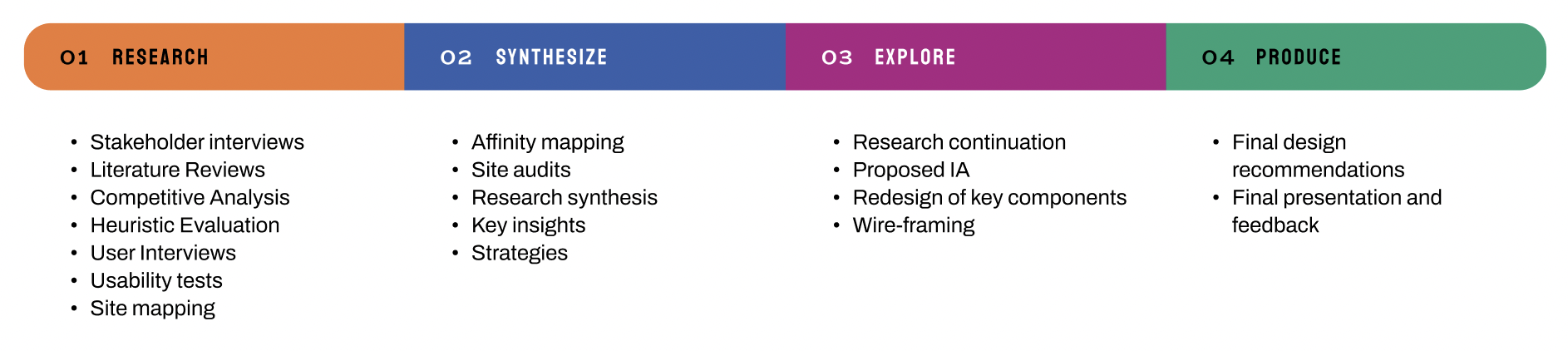
RESEARCH & EXPLORATION
Methodologies
We structured our research process into 3 key phases to understand the market, user needs and design opportunities.
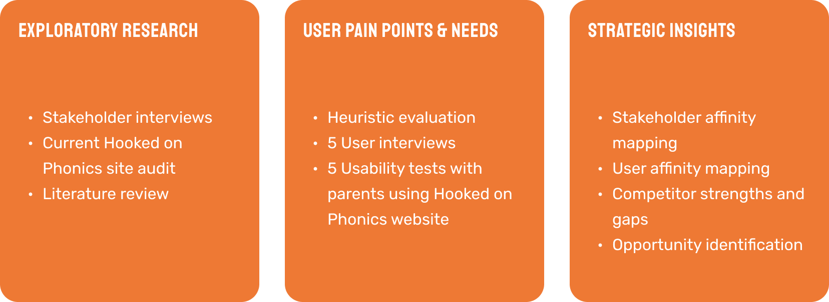
We conducted site audits for the four main competitor sites that were identified by our stakeholders to understand their functional and navigational strengths.
COMPETITive analysis
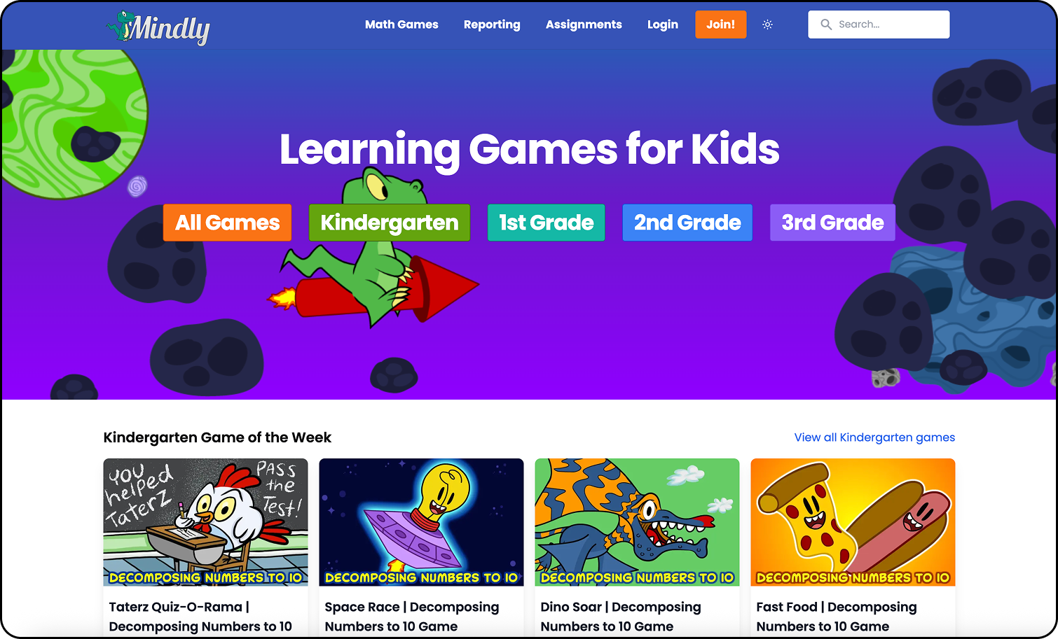
MINDLY GAMES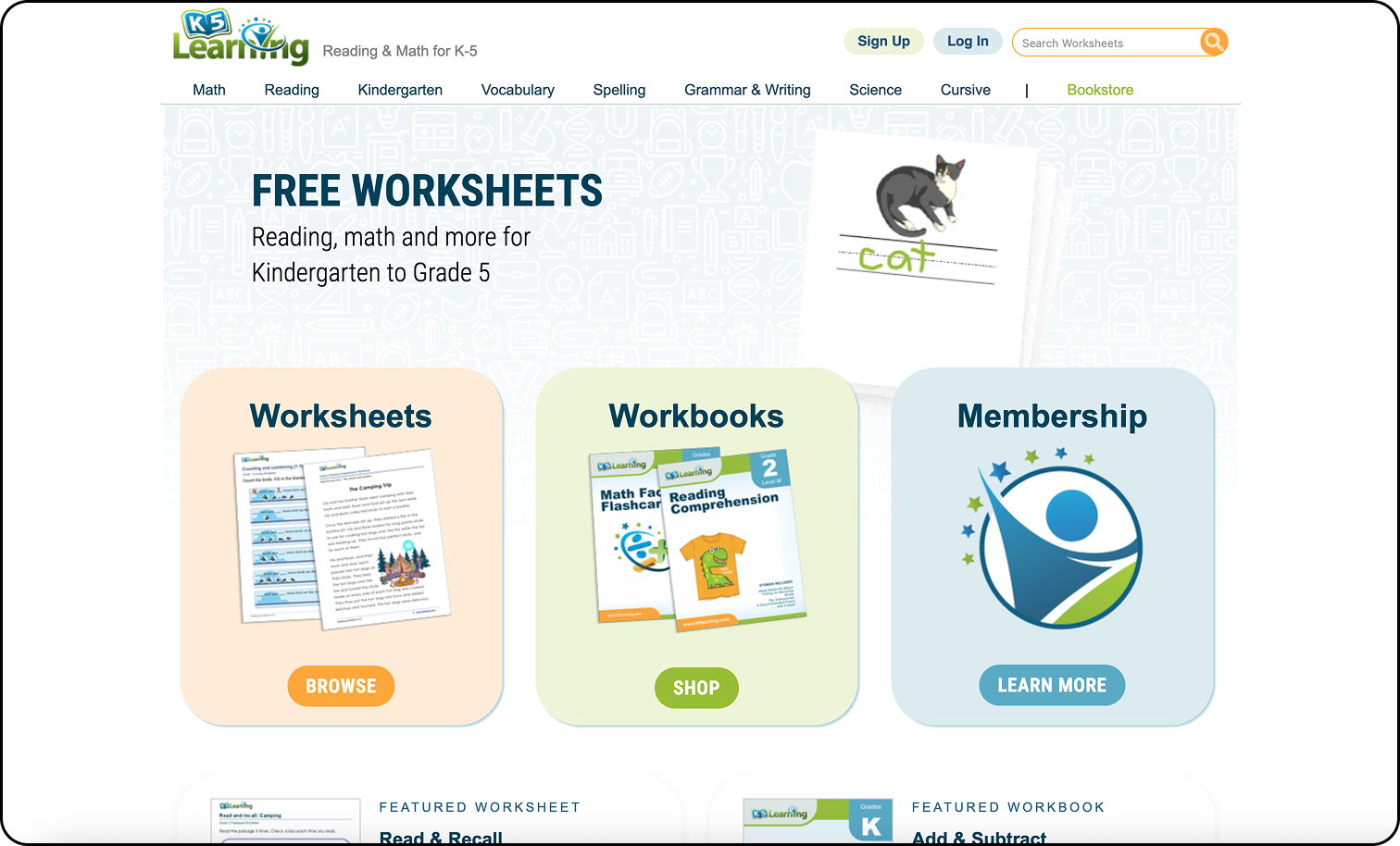
K5 LEARNING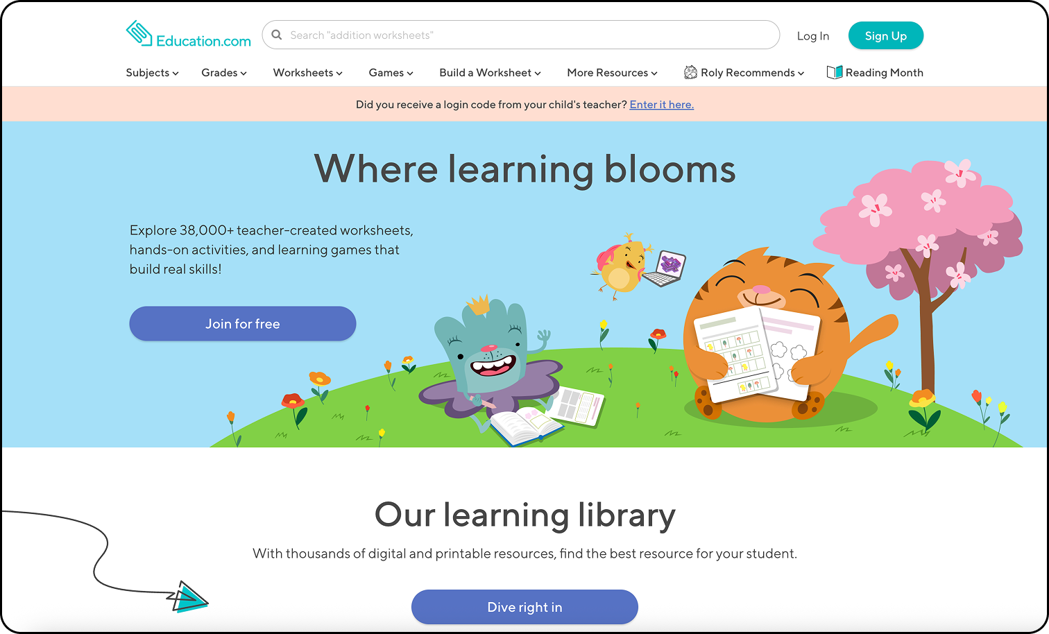
EDUCATION.COM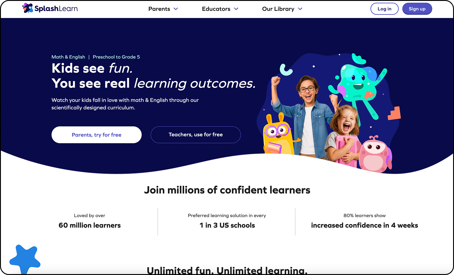
SPLASHLEARN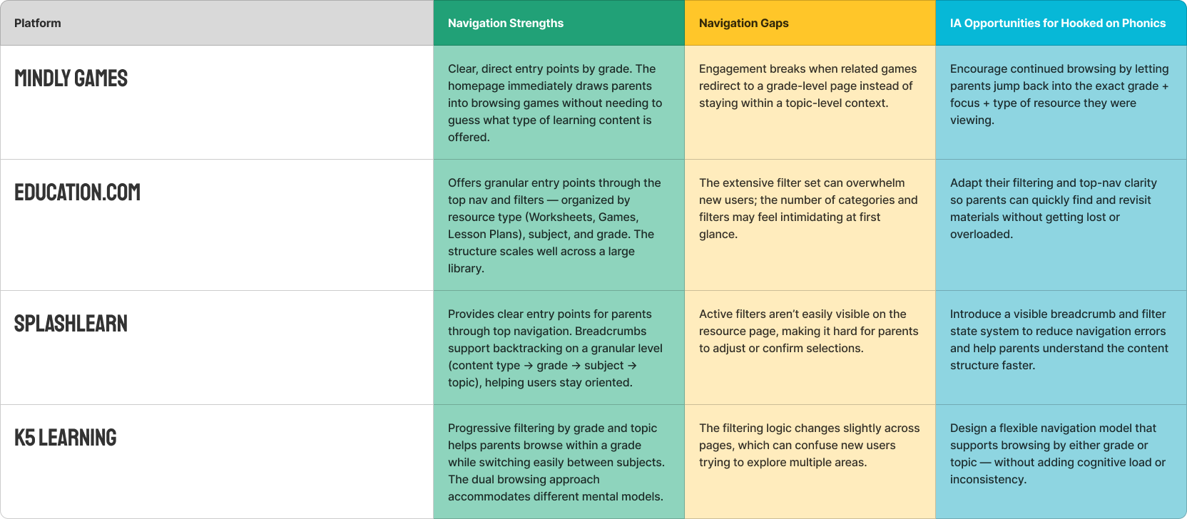
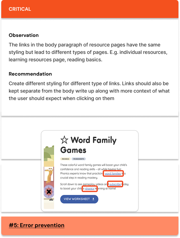
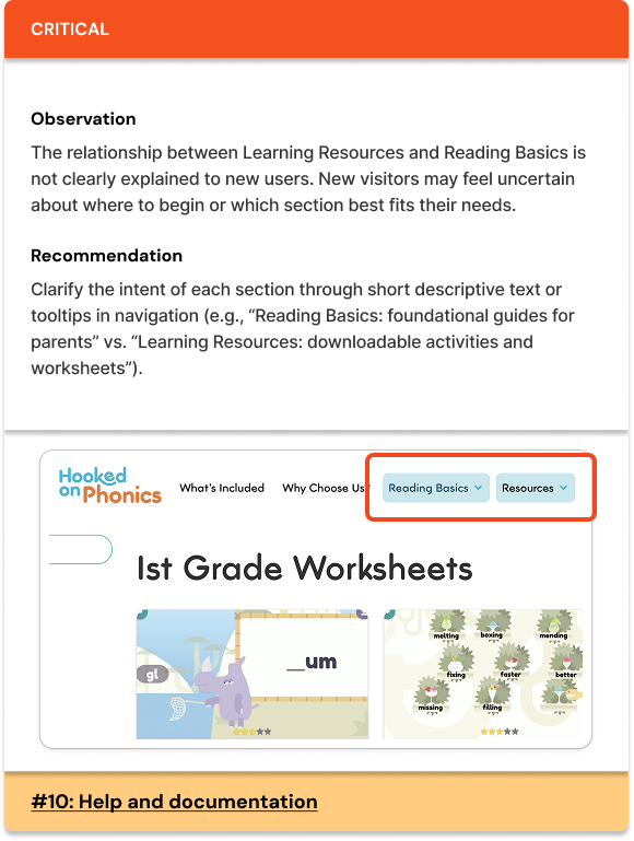
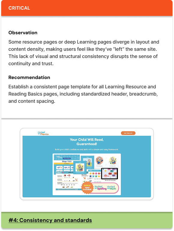
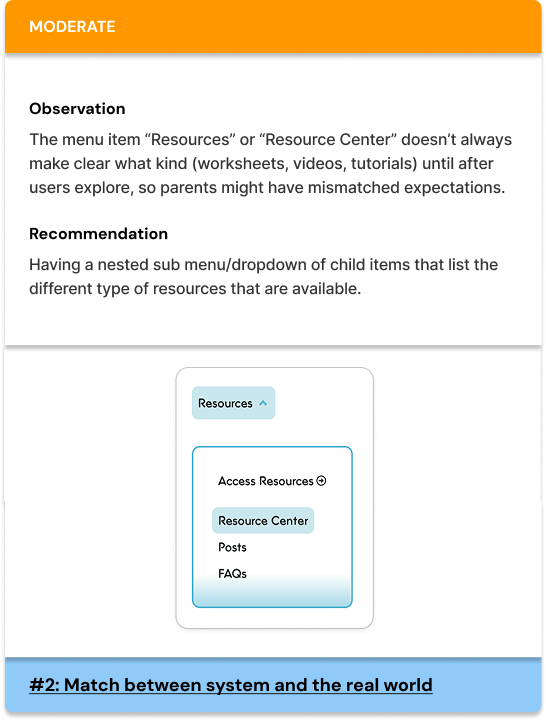
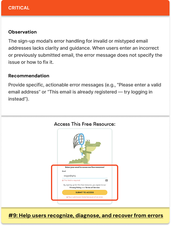
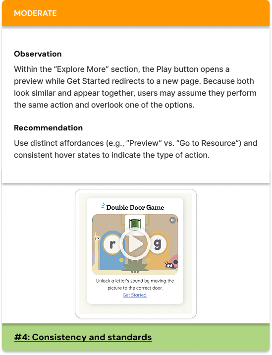
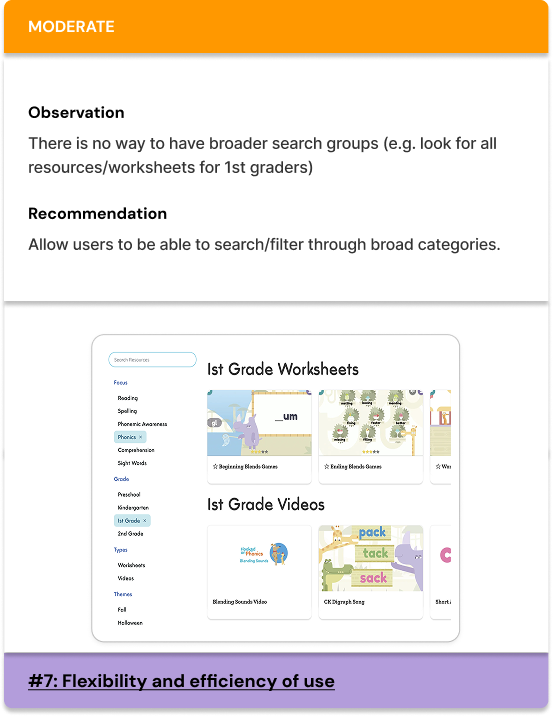
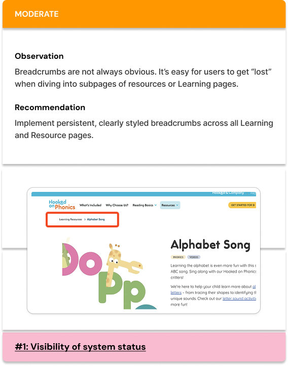
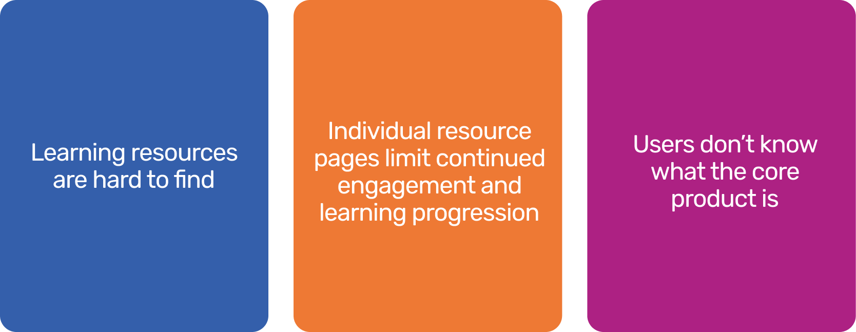
Our heuristic evaluation of the site revealed 9 critical level issues, 6 moderate and 3 cosmetic. These predominantly highlighted problems with content discovery in the learning resource hub, the detailed resource page and the home page.
HEURISTIC EVALUATION
KEY INSIGHTS
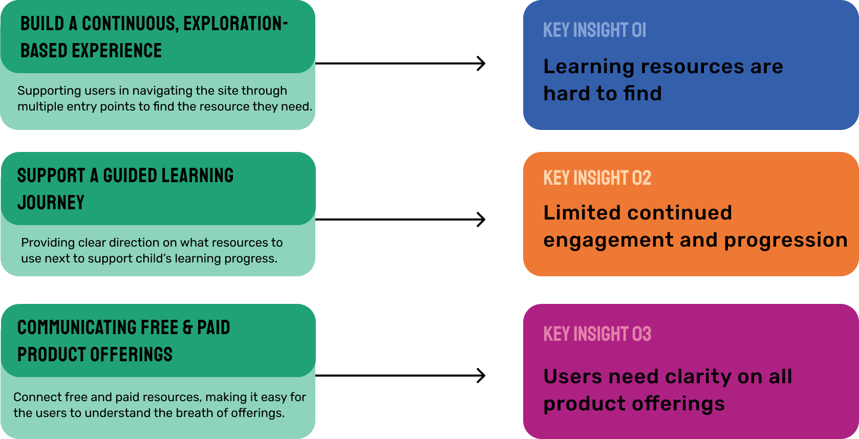
Through our research we landed on the following 3 key insights that uncovered why and how the current state of HoP’s learning resources section is challenged.
2. SYNTHESIS & STRATEGY
BUILDING OUR STRATEGIC DIRECTION
exploration
exploration
Learning resources page
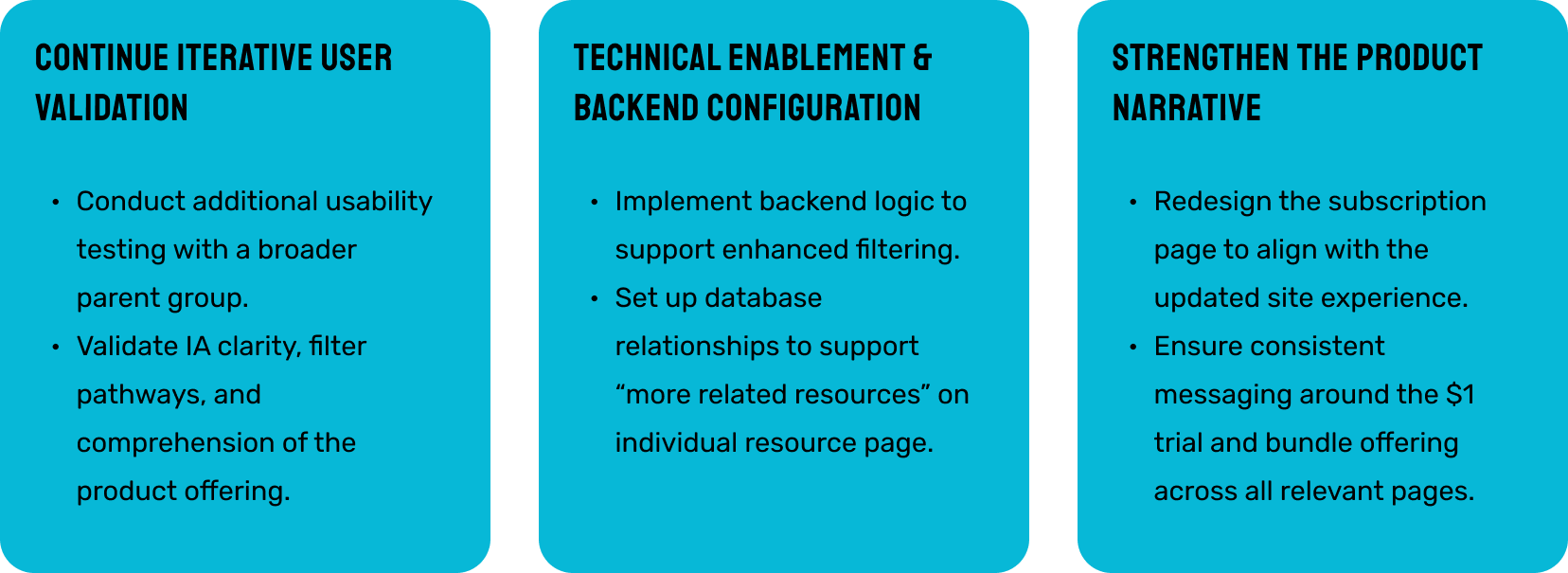
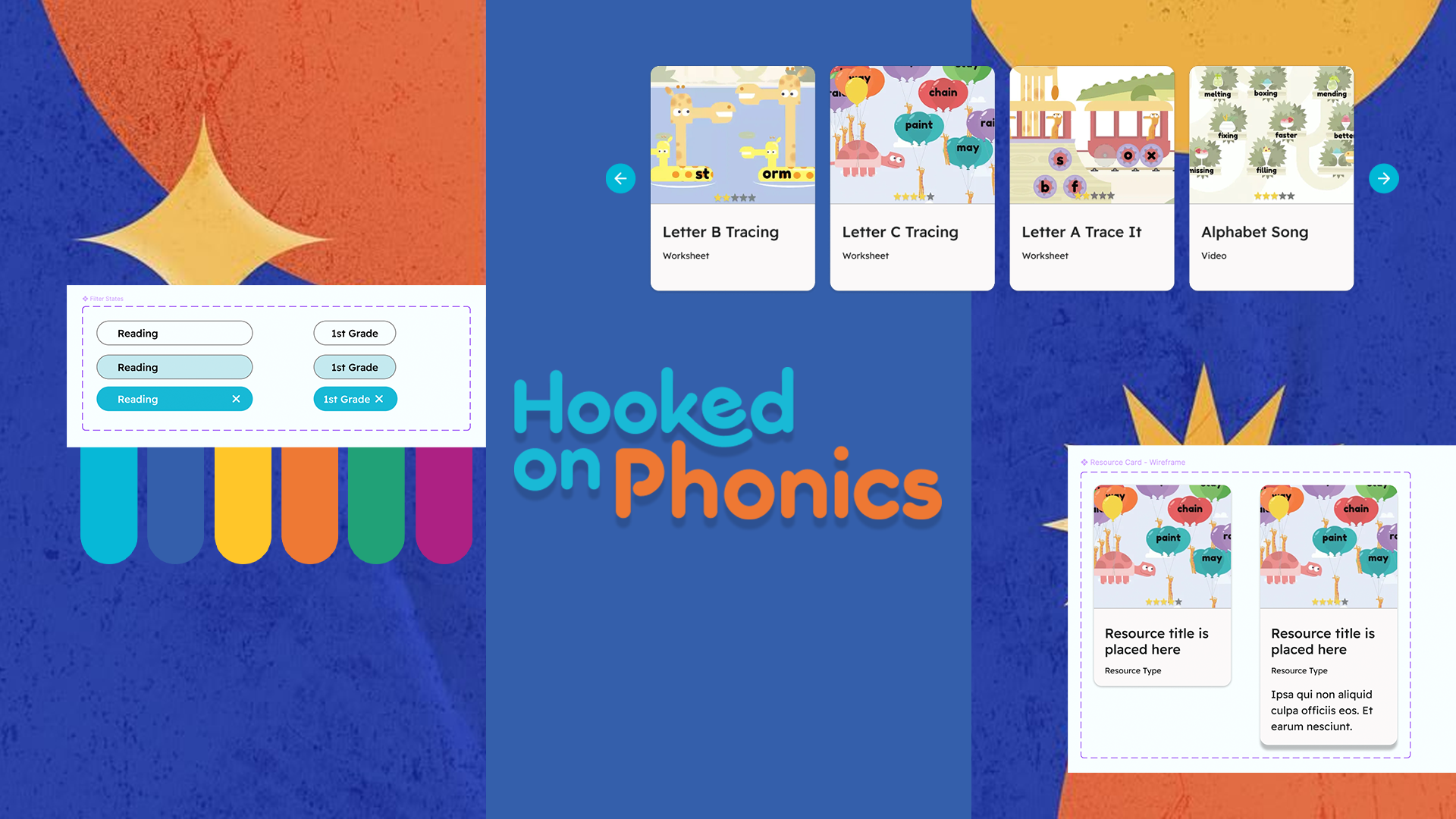
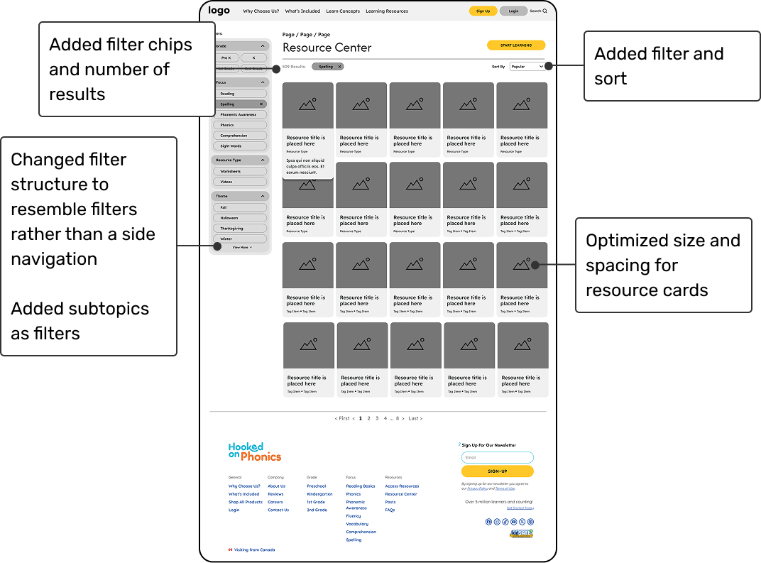
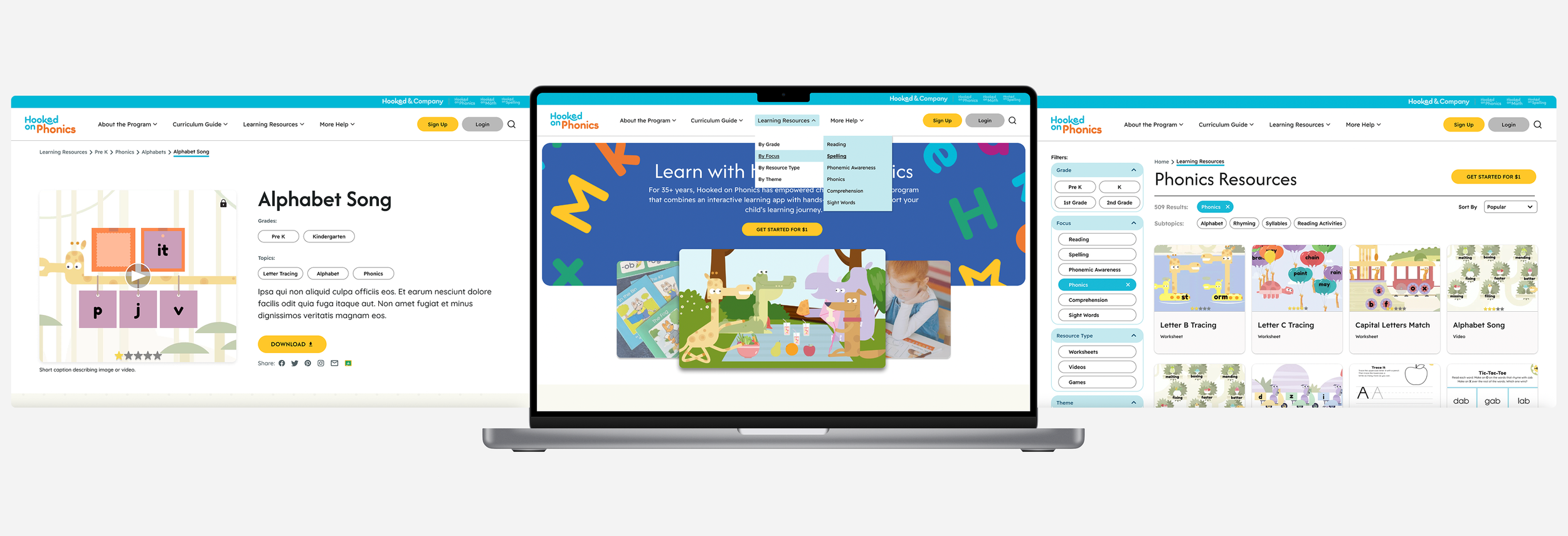
We redesigned the learning resources page to improve exploration and usability. We enhanced the filtering system with clearer filter chips, result counts, expandable sections, and a dedicated sort feature, making it more intuitive and flexible. We also streamlined the header and optimized the card layout to display more resources per row, enabling faster scanning and easier content discovery.
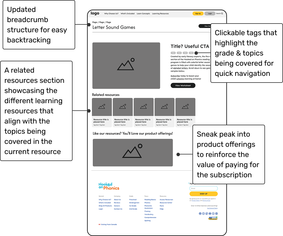
Detailed resource page
The detailed resource page was redesigned to support a clearer learning journey. We improved breadcrumbs for accurate navigation, added clickable tags and related resources for easier exploration, and included a subtle preview of the Hooked on Phonics product to encourage subscription.
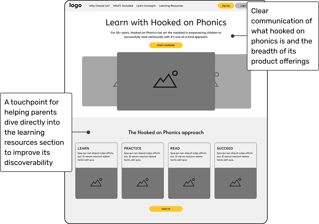
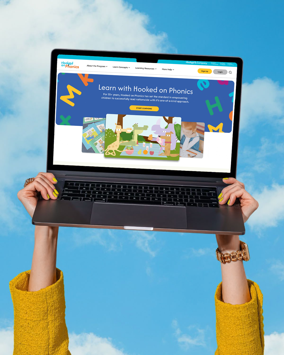
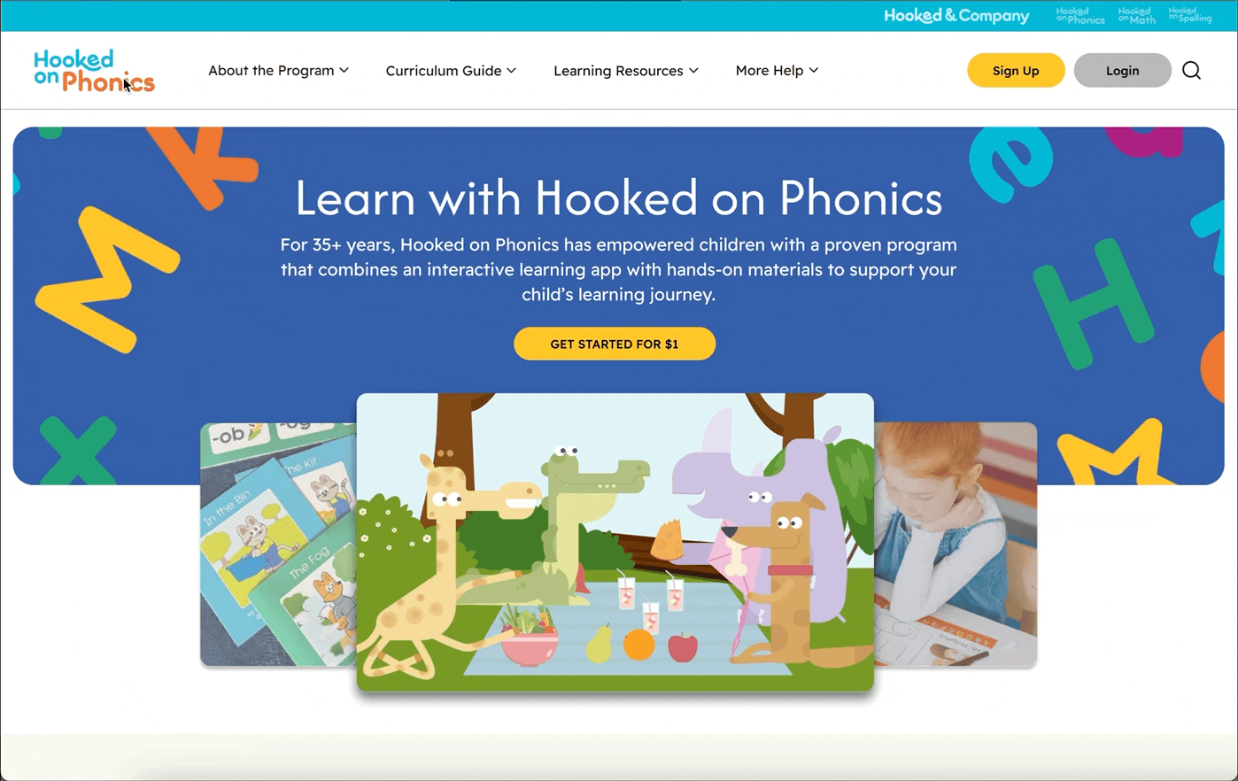
HOME page
The homepage designs focused on clearly communicating what Hooked on Phonics offers, addressing feedback from user testing and competitive audits that showed a lack of clarity. We introduced a defining statement at the top with a supporting image carousel for visual context, and added a clear entry point to learning resources to improve discoverability and user guidance.
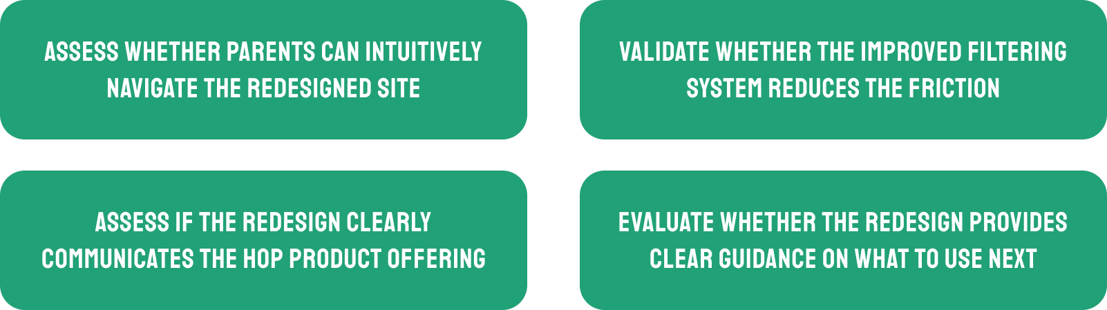
We conducted 5 moderated usability sessions with parents of preschool and early-elementary children. Each session lasted 30–45 minutes and focused on evaluating whether our redesigned navigation, IA, and resource-discovery patterns aligned with parents’ mental models.
TESTING OBJECTIVES
TESTING OUTCOME
Overall, the redesigned experience tested very well. Parents navigated the site confidently, found resources quickly, and understood how to continue their child’s learning. While the core structure and interactions felt intuitive, some terminology and CTA messaging still created moments of uncertainty, revealing targeted areas for refinement.


the FINAL DELIVERABLES