
MANIFOLD TRADING
Manifold Trading is a New York-based systematic, quantitative investment firm specializing in the cryptocurrency and decentralized finance (DeFi) markets. Founded in 2021, the firm blends high-frequency data analysis with sophisticated algorithmic strategies to capitalize on market inefficiencies.
In addition to its role as a liquidity provider and market maker, Manifold acts as an early-stage venture fund, investing in the infrastructure of the web3 ecosystem. Their work is defined by a rigorous, "data-first" approach, where mathematical models and low-latency execution are used to navigate the volatility of digital assets.
-
This was a research and design based project with a primary focus on building a brand identity and design system for a new company product website.
-
TYFYA: Manifold Trading
-
The team comprised of 1 developer, 1 UX researcher and 1 UI designer.
-
UI and Brand Design Intern
-
Client briefing and goal alignment
Analysis of current site and future scope
Preliminary presentations of branding and UI design proposals.
Actioning approved design directions with improvisations and recommendations

Manifold operates at the intersection of high-finance and cutting-edge technology.
PROJECT GOAL: Design a digital platform that helps traders to visualize their strategies.
Visualizing Complexity: Turning "black box" trading algorithms into a clean, professional user interface.
Brand Continuity: Creating branding guidelines that stay consistent across their digital interfaces.
Modern Aesthetic: Moving away from the "crypto-chaos" look toward a sophisticated, high-end digital presence.
Brand & design system
In greek mythology, ‘aether’/‘æther’ is the personification of the bright upper sky.
A rising sun in the sky. The blue color inspires trust, loyalty, wisdom, confidence and stability while keeping a clean and fresh look, true to the brand meaning. The A form of the Ather logo is also in the shape of an arrow pointing up - which conveys positivity and upwards movement.


Using a constant theme of the radiating light of the upper sky across all components in both dark and light modes.
UI DESIGNER
BRAND DESIGNER
VISUAL DESIGNER


SITEMAPPING & WIREFRAMING

In the initial phases of building the Ather Product I solely focused on the structure and arrangement of the grids, tables and charts. Working with these data heavy components almost like puzzle pieces to create layouts that would be the easiest to visual digest and quick to maneuver.
THE PRODUCT
THE PRODUCT

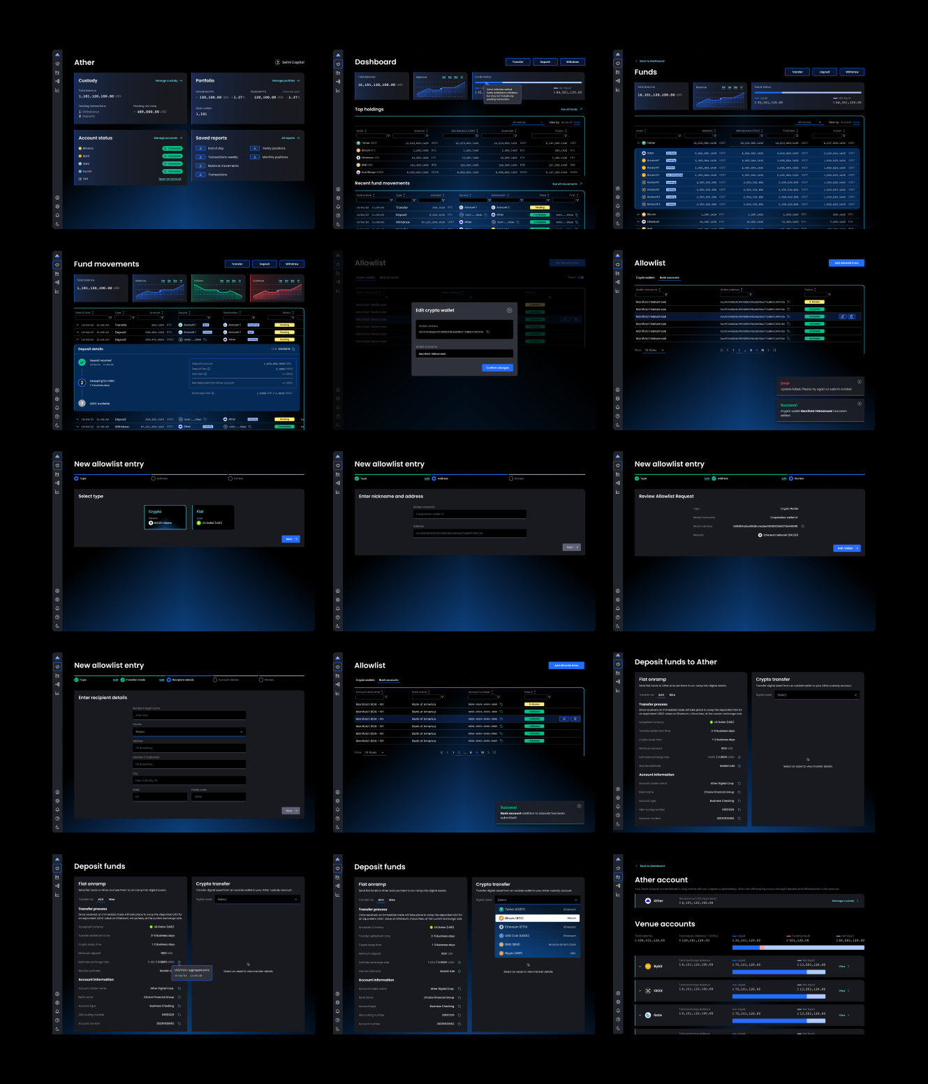


Ather’s core value propositions ‘Direct market access to major liquidity venues’, ‘Smart order router’, ‘Comprehensive reporting’, ‘Trade cost analysis tools’ and ‘Node infrastructure & colocation’ wrapped in a new aesthetic through a brand first approach.